Colour in lighting is one of those choices that looks intimidating and turns out to be the opposite. A green pendant does not dominate a room. It anchors it. It gives a kitchen island a reason to exist, makes a dining table feel like somewhere worth sitting, turns a corner that was previously just a corner into something intentional. We’ve been watching green work its way through interiors for a while now and what strikes us is how many shades are doing genuinely different things. Bottle green is rich and serious. Sage is quieter, almost neutral. Olive sits somewhere between the two and flatters everything around it. The pendants we’ve pulled together here are the ones where the colour and the form are both worth committing to, not just a coloured version of something ordinary. Good scale, proper materials, shades that will look right in three years as well as right now. Green lighting rewards the decision.
-

Dar Lighting Hadano Light Bar Ceiling Pendant Light In Antique Chrome With Olive Shades
$601.00 -
Dar Lighting Hadano Light Bar Ceiling Pendant Light In Natural Brass With Olive Shades
$738.99 -
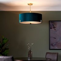
Endon Hayfield Light Ceiling Pendant In Matt Antique Brass Finish With Green Velvet Shade
$182.40 -
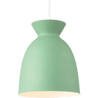
Firstlight GN Maisie Light Ceiling Pendant Light In Green Finish
$51.04 -

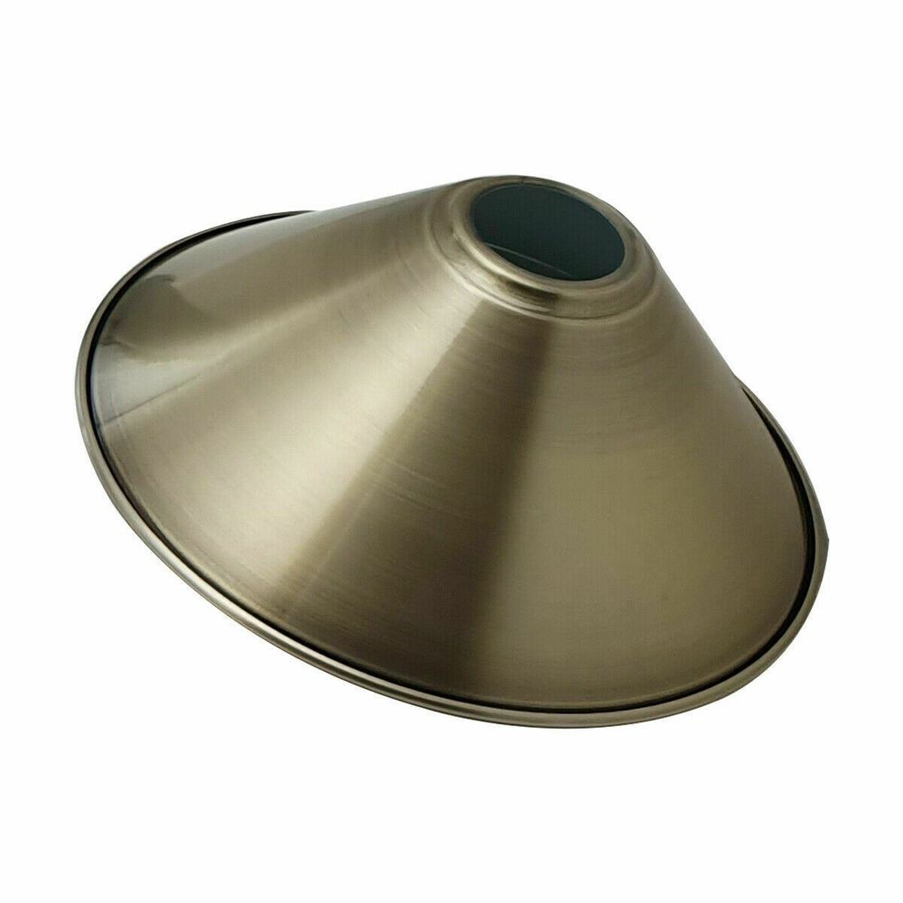
Modern x Cone Light Shades Metal Easy Fit Ceiling Pendant Hanging Lampshade only
$8.94 -
Modern x Cone Light Shades Metal Easy Fit Ceiling Pendant Hanging Lampshade only
$8.94 -
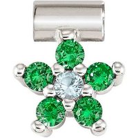
Nomination SeiMia Silver Green & Light Blue CZ Flower Pendant Charm
$22.00 -
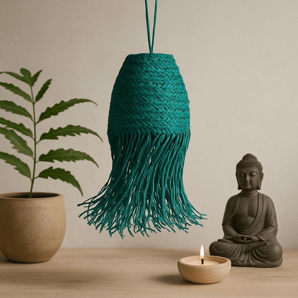
Pendant Light Shade Teal Braided Doum x
$35.29 -

Valuelights Holborn Brushed Gold With Scallop Shade Ceiling Pendant Light In Dark Pink
$26.99 -
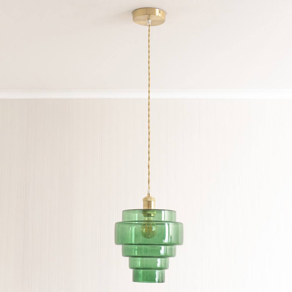
Valuelights Lane Glass Tier Shade Brushed Chrome Ceiling Pendant Light And Bulb In Bright Green
$37.99 -
Valuelights Lane Glass Tier Shade Brushed Gold Ceiling Pendant Light And Bulb In Bright Green
$48.00 -
Valuelights Millie Metal Flower Style Scallop Ceiling Pendant Light And Bulb In Pale Pink
$32.99 -
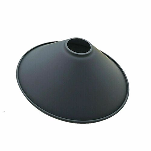
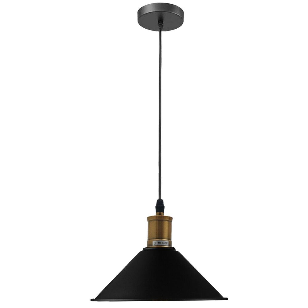
Vintage Industrial Ceiling Pendant Light Retro Loft Style Metal Shade Lamp – Without Bulb Black
$13.94 -
Vintage Industrial Ceiling Pendant Light Retro Loft Style Metal Shade Lamp – Without Bulb Orange
$13.94