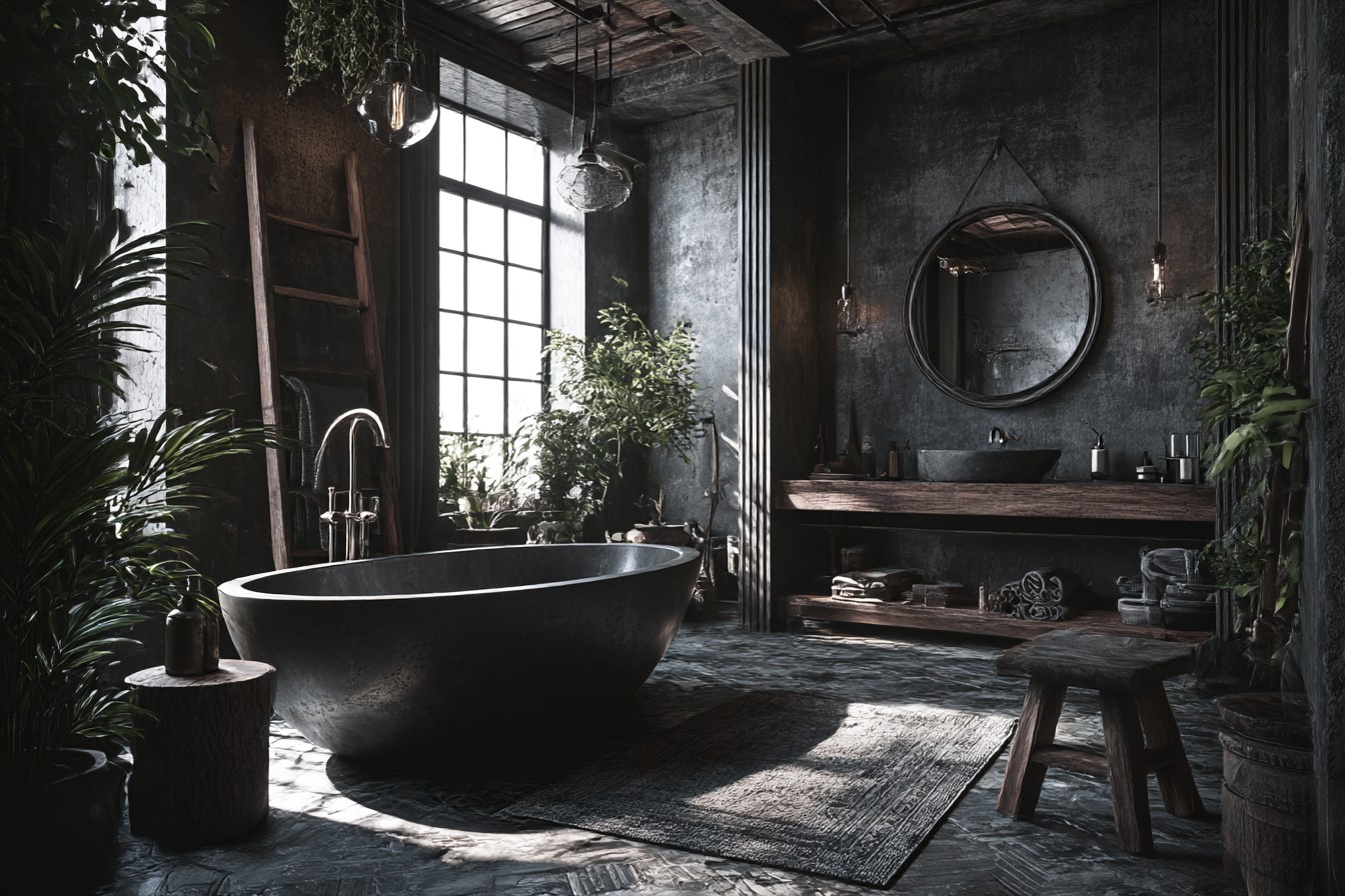
Last month I popped round to my mate Marcus’s place for a beer and had to use his loo. Honestly? Walking into that bathroom was like entering some sort of hardware store showroom gone wrong. The man had basically taken every “masculine bathroom” Pinterest board he could find and mashed them all together into this overwhelming dark cave.
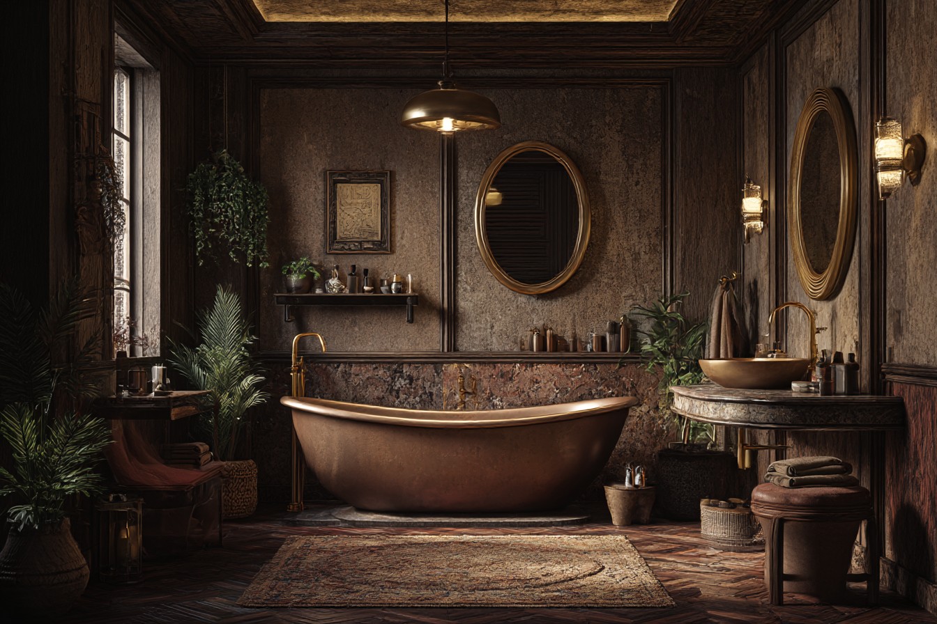
Everything was black. And I mean everything – black subway tiles, black grout, black fixtures, black towel rail, even the bloody soap dispenser was matte black. There were exposed copper pipes everywhere (pretty sure some of them weren’t even functional, just there for the aesthetic), a mirror with this chunky weathered metal frame that looked like it came from a skip, and towels in various shades of charcoal grey because heaven forbid there’s any colour in there.
Don’t get me wrong, Marcus is obsessive about cleanliness – you could probably perform surgery on his bathroom floor. But visually? It felt like washing your hands in a post-apocalyptic bunker. I kept expecting someone to emerge from the shadows wearing leather and asking about my water rations.
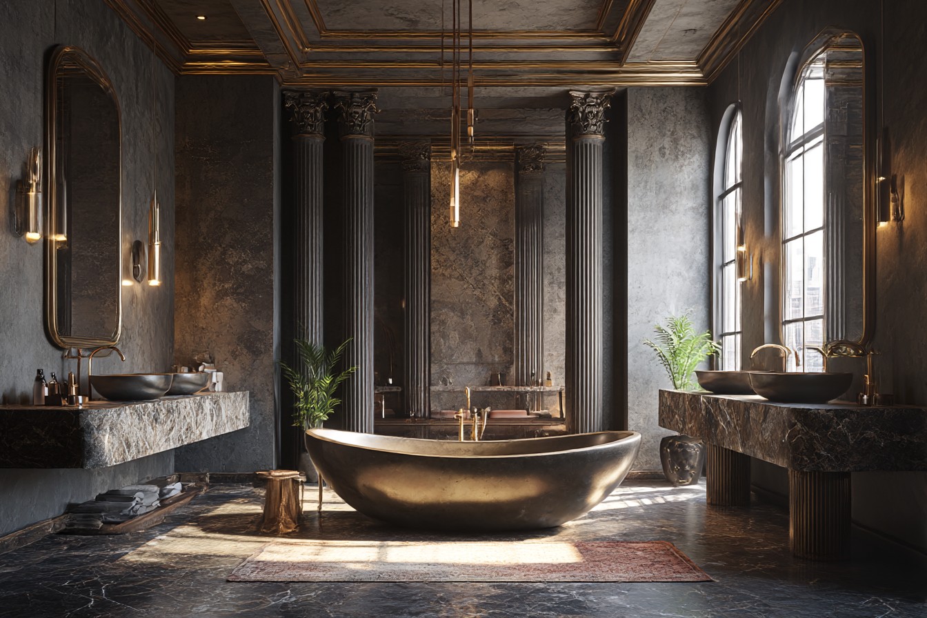
That visit really got me thinking about how we’ve created this bizarre either-or situation with bathroom design. You’ve either got the full spa-feminine treatment with white marble everything and gold taps that cost more than my monthly rent, or you go completely the other way with industrial fixtures and enough exposed metal to build a submarine. There’s apparently no middle ground between “princess powder room” and “zombie apocalypse washroom.”
But here’s the thing – and I learned this the hard way after making some spectacularly bad choices in my own flat – creating a genuinely masculine bathroom doesn’t require embracing your inner industrial designer. Some of the best masculine spaces I’ve seen actually rely on restraint and, shock horror, a bit of warmth.
Take the bathroom I helped my neighbour James sort out last year. Poor bloke had been living with the full builder-grade nightmare since he moved in – white plastic everything, one of those mirror cabinets that looks like it was nicked from a Travelodge, vinyl tiles pretending to be stone and fooling absolutely no one. His brief was spot-on: “I want it to feel like a proper gentleman’s bathroom, but I don’t want to feel like I’m washing up in my garage.”
We started with paint, which sounds boring but honestly makes the biggest difference for the least money. Instead of going down the predictable charcoal route that every “masculine design” blog bangs on about, we chose this gorgeous muted sage colour. I know, I know – sounds risky. But hear me out.
Bathroom colour is tricky because it needs to work with morning light (brutal), evening light (hopefully more forgiving), steam, condensation, and the harsh reality of seeing yourself in the mirror at half past six in the morning when you look like you’ve been dragged through a hedge backwards. That sage was absolutely brilliant – masculine without being aggressive, calming without being boring, and sophisticated enough that it made all his basic white fixtures look intentional rather than cheap.
For the floor and walls, we ditched those trendy hexagon tiles that everyone’s obsessed with (they show every single water drop and soap scum mark, absolute nightmare to keep looking decent) and went with large-format porcelain in this soft concrete finish. Not proper concrete – that’s cold and horrible to live with – but porcelain that looked like concrete with subtle variations and a lovely matte texture. The trick was choosing tiles big enough that you barely saw any grout lines, so you got these clean, uninterrupted surfaces that looked expensive without actually costing a fortune.
This is where I had a bit of an epiphany about masculine design – it’s often about what you don’t put in rather than what you do. Instead of cramming in loads of statement pieces and trendy fixtures that’ll look dated in two years, we invested properly in a few quality bits. Got him a solid walnut vanity (proper walnut, not that laminate stuff that fools nobody) with brushed brass handles.
Now, brushed brass might sound a bit fancy, but it’s not the shiny traditional brass that makes you think of your gran’s house. This contemporary brushed finish feels warm and current without being flashy. Much better than chrome, which always looks a bit clinical, or black hardware, which just disappears and makes everything look unfinished.
The mirror was probably my favourite decision. James wanted a medicine cabinet because “that’s what you have in bathrooms,” but I convinced him to try something different. We found this round mirror with a thin brass frame – sounds feminine when I describe it like that, doesn’t it? But the proportions and that brass finish made it feel substantial and sophisticated. Sometimes the choices that sound wrong on paper work brilliantly in real life.
Lighting is where most people go wrong, and I speak from experience here because I definitely went wrong with it in my own place initially. Those standard vanity strip lights that come with most bathroom fittings make everyone look like extras from a zombie film. We installed proper sconces on either side of the mirror instead – simple cylindrical fixtures in brass with white glass shades. The light is even and actually flattering, plus they add proper architectural interest without being fussy.
Storage was crucial because, let’s be honest, men’s bathrooms often turn into disaster zones when there’s nowhere to put anything. We built a recessed niche in the shower (tiled in the same stuff as the walls so it basically disappeared) and added one narrow shelf under the mirror. Not floating shelves everywhere – just strategic storage that kept the lines clean and uncluttered.
The shower was where we really avoided the typical masculine bathroom clichés. No black fixtures, no exposed plumbing pipes snaking everywhere, no ridiculous rainfall showerhead the size of a car wheel. Just a high-quality shower system in that same brushed brass with a handheld option for practicality. The shower walls were the same large tiles as the floor, carried right up to create continuity, with one accent wall in natural limestone – smooth stuff that’s actually manageable to keep clean, not the rough textured stone that collects soap scum like it’s collecting rare stamps.
Accessories were minimal but properly considered. Two matching towel rails in brass, a soap dispenser that looked like it belonged there rather than something grabbed from the Boots clearance shelf, and – controversial this – a plant. Yes, plants work in masculine bathrooms if you choose something architectural like a snake plant rather than flowers everywhere.
The whole project cost about £3,200 including getting someone in to do the tiling properly (I learned from bitter experience that tiling is not a weekend DIY job). Not exactly pocket change, but James reckoned it was the best money he’d spent on the house. The space feels sophisticated and grown-up without relying on any of those tired dark industrial clichés that make bathrooms feel like underground car parks.
What really surprised me was how many people commented on the space – not just blokes, but women too. Turns out that well-designed masculine spaces aren’t just appealing to men. They’re appealing to anyone who appreciates quality, restraint, and design that’s actually thought through rather than just following whatever’s trending on Instagram this week.
The whole experience taught me that masculine design doesn’t have to mean dark, moody, or industrial. Sometimes it just means choosing better materials, keeping lines clean, and having the confidence to ignore trends that don’t actually make your life better. Much like debugging code, really – sometimes the most elegant solution is the one that removes complexity rather than adding it.