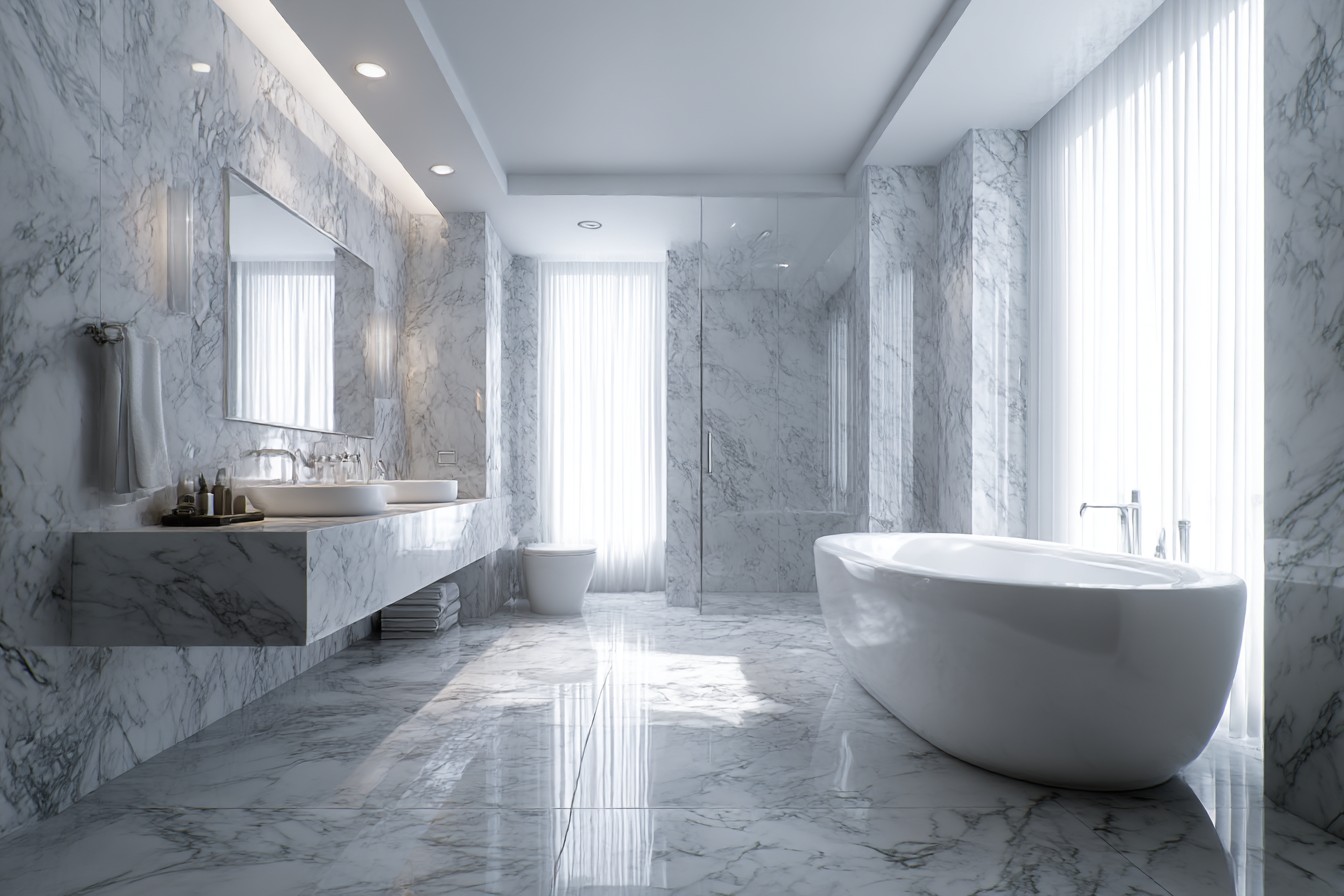
Right. So I’m having my morning coffee, and looking at the bathroom through the open door, and it still makes me smile. Not because it’s anything fancy it’s literally just grey and white, which is probably the most obvious color combination that exists. However, it took me three proper attempts and roughly six months of living with what I call a decorative disaster to get it “right.”
So we first moved into our little terrace, the bathroom was this awful magnolia and brown affair that made you want to take deep breaths every time you brushed your teeth. Classic rental property decor, you know? Danny kept saying we should just leave it alone since we rent the place, but I couldn’t bear to look at it every day. In addition, I had watched a ton of YouTube videos about rental-friendly bathroom remodeling ideas and got a bit carried away with myself.
First time around at going with grey and white, I was absolutely disastrous. Corporate office canteen level of soul-crushing. I’d purchased this medium grey paint from B&Q can’t recall the exact name but it was something like “Urban Sophistication” or whatever other garbage and paired it with the brightest white tiles I could find. Thought it would look super sleek and modern. Instead, it looked like a hospital toilet. And not even a nice private hospital.
It wasn’t until after living with it for about two weeks that I realized I had treated grey and white like they’re two colors and not fifty different moods. That bright white made the grey look dull and depressed. The grey made the white look cold and clinical. They were essentially having a fight on my walls every morning.
I started over with what I’ve come to refer to as “almost white,” you know, those colors that appear to be white until you compare them directly to actual white and realize they have a very slight warmth to them? Located a shade called “Pointing” by Farrow & Ball, however, I couldn’t afford Farrow & Ball, so I brought the sample to Dulux and asked if they could color-matched it. I paid eight pounds instead of forty-five, which gave me additional budget for everything else.
For the grey, I was far softer this time. Much less “concrete block,” much more “misty dawn.” Gained this lovely warm grey that shifts throughout the day appears to be a bluish gray during the morning hours, a straight-up gray at noon, and a purplish gray in the evening. What an awesome feature of undertones, eh? Although I figured that out the hard way by painting the entire room prior to realizing how it looked at various times of the day.
However, it was the texture that ultimately changed the game my first effort was totally smooth and flat surfaces and it looked completely flat, like a showroom nobody wanted to ever use. This time I blended it up properly. Kept the walls painted due to the fact we rent, but I added this gorgeous peel-and-stick wallpaper with a subtle linen texture on the wall behind the toilet. Costs approximately £30 and I spent half of a Saturday putting it up, mainly because I kept measuring twice and sticking once.
The shower curtain was another total game-changer. Swapped out the nasty plastic curtain that came with the home for this waffle-weave fabric curtain from Dunelm. The curtain is white, but it has lots of texture, and it looks intentional rather than simply functional. Additionally, it doesn’t cling to you when you are taking a shower, which is always a plus.
Floor situation was trickier as I obviously couldn’t remove the current tiles. However, I discovered these fantastic peel-and-stick tiles that generate a soft checkered design not the aggressive black and white chess design, more like natural and soft organic designs in varying shades of grey and off-white. I acquired them from a business online after spending an enormous amount of time surfing through options. The installation process was pretty therapeutic once I stopped worrying about ensuring every single tile was placed perfectly in alignment.
Storage becomes a major factor with grey and white, because any specks of dust show up like they are under a microscope. That stunning white floating shelf I installed? Became a tribute to every single water droplet and stray hair inside of about three days. I currently utilize a large number of woven rattan baskets and storage containers to conceal the inevitable mess. I found these lovely woven rattan containers at TK Maxx that add warmth to the space without conflicting with the color scheme.
Lighting was basically the thing that almost ruined the whole project. That harsh ceiling light made everything appear flat and unflattering not what you want to see first thing in the morning when you’re already wondering about your decision-making. I couldn’t rewire anything, obviously, but I could add layers. Added a small LED lamp on the windowsill (yes, I know, a lamp in the bathroom, but it has the correct IP rating and the bathroom police haven’t charged me with a crime yet.) I also added these battery-operated LED strips underneath the floating shelf that produce a nice soft lighting effect in the evenings.
The mirror was another surprise hit. Swapped out the typical rectangle builder’s mirror with this round one I obtained at a charity store in Beeston nothing special, possibly £15, but the circular form softens all of the hard edges of the tiles and fixtures. Sometimes, it’s the simple changes that make the greatest impact.
Houseplants required a lot of trial and error, by which I mean I killed numerous poor houseplants before discovering some that are capable of surviving bathroom moisture. Apparently, Pothos and ZZ plants are virtually indestructible they simply remain sitting in front of you, looking green and alive, without requiring any actual horticulture skill from me. The few splashes of greenery help prevent the entire area from feeling sterile, and add some life without overpowering the color scheme.
I tested it thoroughly by having my sister and her kids visit for a week back in May. I’m sure you’ll agree with me; you eventually become oblivious to your own space. Watching others using the bathroom allowed me to view the space I built. The way the morning sunlight catches that textured wall perfectly. The way the soft grey makes the white seem clean rather than stark. Every aspect of the space seems connected without being overly uniform or boring.
My mom continues to believe I should have picked “a proper color,” she is obsessed with this sage green at the present time, however, I have developed a liking to this grey and white color combination in ways I did not anticipate. It’s attempting to make no statements. It simply provides a sense of quiet satisfaction when brushing your teeth and taking a shower.
Really, shouldn’t that be the function of good interior design?


