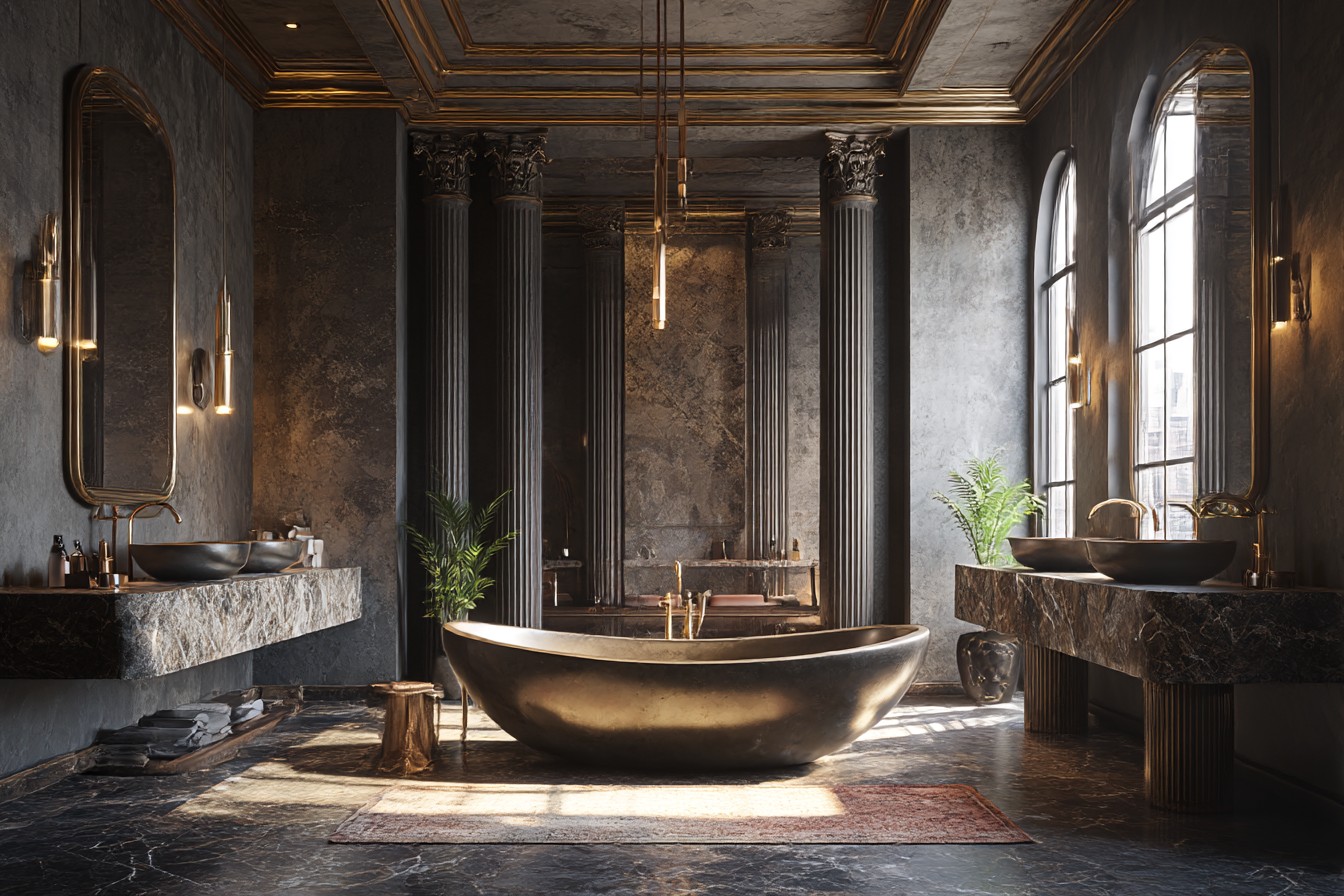
I was round at my mate Sarah’s house last month, and she directed me to use the downstairs loo. The moment I stepped inside, I felt like I’d been swallowed by a jewelry box. She’d painted it this gorgeous deep navy blue – the kind of color you see all over Pinterest – but honestly? I could barely see my own reflection in the mirror without squinting.
“I thought it would feel cozy,” she said when I came out, obviously reading my expression. “But I’ve started putting the light on even when it’s bright outside.”
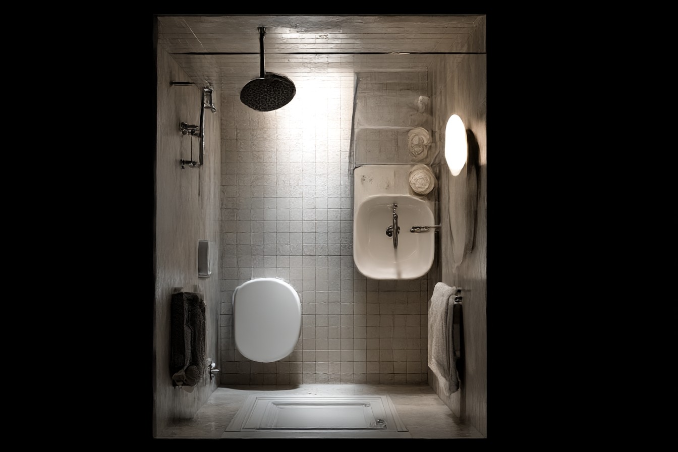
That’s exactly the problem I’ve run into so many times with small bathrooms. Dark colors don’t just make spaces look smaller, they literally steal light from rooms that usually don’t have much to begin with. My own bathroom is about the size of a large cupboard, and I’ve learned through years of trial and error (mostly error, if I’m honest) that the right color can genuinely trick your brain into seeing more space than actually exists.
When Phil and I bought our house, the bathroom was painted in that awful builder’s magnolia that somehow manages to look grubby even when it’s fresh. I knew I wanted something better, but I also knew we couldn’t afford to start knocking walls down or installing those fancy roof lights you see in magazines.
The first color I tried was called “Soft Mint” – sounds lovely, doesn’t it? Looked absolutely dreadful. Like someone had smeared toothpaste all over the walls. Even though it was supposed to be subtle, that green tint just sucked up what little natural light came through our tiny frosted window. I ended up repainting the whole thing two weeks later, which was expensive and annoying, but taught me never to trust those fancy paint names.
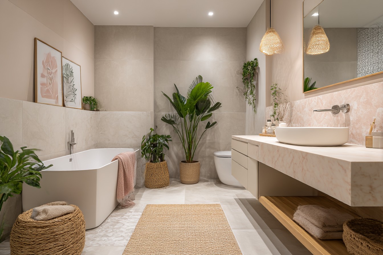
These days I stick to proper whites, and I mean actual whites, not the ones that claim to be white but have all sorts of sneaky undertones lurking underneath. I’ve used Benjamin Moore’s Simply White in three different small bathrooms now and it’s brilliant. Reflects light like you wouldn’t believe. People actually comment on how “spacious and bright” my bathroom feels, which makes me laugh because it’s still absolutely tiny with one small north-facing window.
Here’s something I discovered completely by accident though – warm whites work so much better than cool ones in bathrooms that don’t get much natural light. Found this out when I helped my sister paint her en-suite in what looked like a gorgeous crisp white in the shop but turned out to have blue undertones. Under her bathroom lights, it looked like a hospital. Really cold and clinical and not somewhere you’d want to relax in the bath.
The real magic happens when you think about the ceiling color too. Most people automatically paint bathroom ceilings white, but I’ve started using just the tiniest hint of color instead. Mine’s painted in the faintest possible grey-blue – so subtle you probably wouldn’t notice unless I told you – but it makes the ceiling seem higher because your eye doesn’t immediately see where the wall stops.
I quite like pale greys for small bathrooms, but you’ve really got to watch out for undertones. Made the mistake once of choosing what looked like a lovely neutral grey that went distinctly purple under artificial light. Nothing wrong with purple bathrooms necessarily, but when you’re brushing your teeth at half past six in the morning, you don’t want to feel like you’re in some sort of nightclub.
Soft blues can be absolutely gorgeous if you get the right shade. I’m talking about colors that are barely there – like looking at the sky on a really pale winter day. Anything stronger and it starts feeling cold. I painted a friend’s tiny guest bathroom in Farrow & Ball’s Borrowed Light last year (yes, ridiculously expensive, but sometimes you need to see what perfection looks like before you hunt for the Dulux equivalent). The transformation was incredible – the room genuinely seemed twice as big and so much calmer.
There’s this trick I stumbled on when I was helping our neighbor Dave with his Victorian terrace renovation. Use the same color on walls and ceiling, but in different finishes. Walls in eggshell, ceiling in matt. Creates this lovely subtle depth without any harsh lines where surfaces meet. Your eye can’t quite work out where one bit ends and another begins, which somehow makes the whole space feel bigger.
Cream can work beautifully, but it’s proper tricky to get right. Too yellow and your bathroom looks dingy. Too pink and it feels dated, like something from the eighties. I found one that’s perfect though – Farrow & Ball’s String (and there’s a much cheaper Dulux one called Natural Calico that’s nearly identical). Got just enough warmth to feel welcoming without looking yellow under those harsh bathroom lights.
The biggest mistake I see people making is choosing colors based on how they look under good natural light. Thing is, bathrooms are usually the darkest rooms in most houses. You’re generally in there under artificial lighting, often those bright LED bulbs that make everything look different. I always tell people to take paint samples home and stick them on the actual bathroom wall. Look at them first thing in the morning when you’re getting ready, then again in the evening. That gorgeous color that looks perfect at lunchtime might be completely wrong when you’re having a bath at night.
I’ve got this whole folder of paint chips that didn’t work – colors that looked amazing elsewhere but were disasters in small bathrooms. Sage green? Too muddy under artificial light. Pale pink? Surprisingly claustrophobic, though I can’t explain why. Anything with grey undertones that’s sold as “white”? Usually ends up looking grim.
Paint finish makes a massive difference too. Always use eggshell or satin in bathrooms now, never matt. That slight sheen bounces light around the room and makes everything feel brighter and more open. Matt paint just seems to absorb light and shows up every tiny imperfection in your walls.
If you’re renting and can’t paint, or you’re just not ready to commit to redoing the whole room, try changing your light bulbs first. Warm white LEDs – around 3000K if you want to get technical about it – make almost any color look better than those cool white ones. I switched all ours last year and couldn’t believe what a difference it made. Suddenly my white walls looked warm and inviting instead of stark and cold.
The thing about small bathroom colors isn’t really that complicated, but you do need a bit of courage. You’ve got to resist the temptation to make dramatic statements and focus on creating light and space instead. Not always the most exciting approach, I’ll admit, but when you’re rushing around trying to get ready for work in the morning, you’ll be grateful you chose function over being fashionable. Trust me on that one.