You know that moment when you walk into a space and immediately want to leave? That was me, standing in the bathroom of my Chorlton flat for the first time. The smell hit me straight away – this musty, slightly antiseptic scent that basically screamed “rental property, circa whenever beige was considered peak sophistication.” I’m staring at these tiles that had definitely seen better decades, and there’s this mirror with a frame that I can only describe as aggressively bronze plastic. Like, whoever chose it was really committed to making sure everyone knew it wasn’t real metal.
But here’s the weird thing – the window faces east, right? And that morning, sunlight was streaming through, bouncing off those tragic tiles and creating these absolutely gorgeous, shimmery reflections on the ceiling. Looked exactly like sunlight hitting water. That’s when something clicked in my brain. I didn’t need to actually live by the sea to feel like I did, you know?
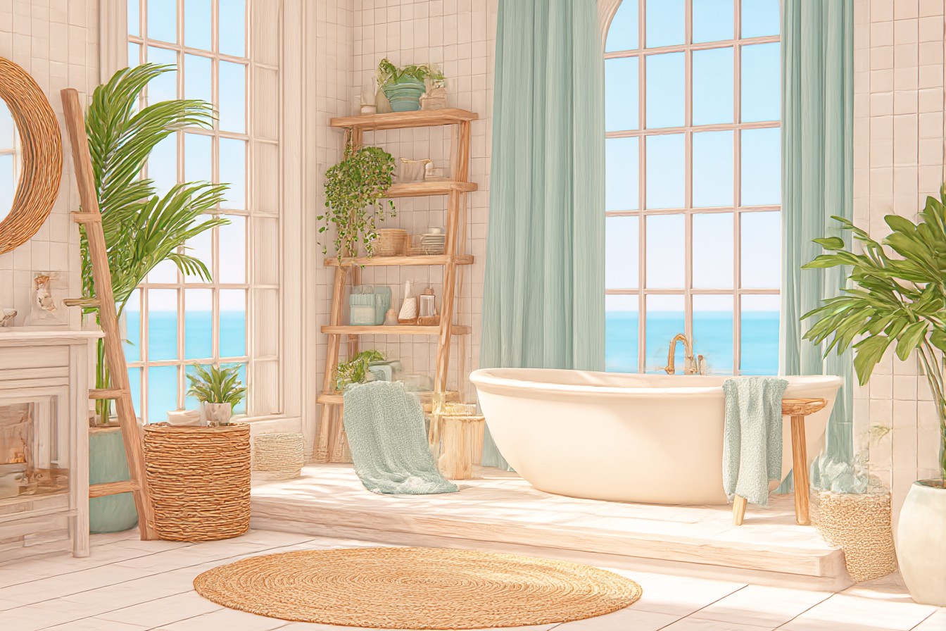
Now look, I get it. Beach-themed anything can go sideways incredibly fast. We’ve all been in those bathrooms that look like someone robbed a nautical gift shop and then sneezed everything onto the walls. Anchors on literally everything, shells super-glued to mirrors with what looks like a hot glue gun from 1997, that horrible rope trim that just collects dust and makes you wonder if pirates actually had proper plumbing. But there’s a massive difference between coastal-inspired design and… well, maritime chaos.
The trick isn’t avoiding beach elements completely. It’s choosing them like you actually have some idea what you’re doing.
I started with colour because that’s always my default when a space feels fundamentally wrong. Instead of going with the obvious navy-and-white thing (which, don’t get me wrong, totally works when someone does it properly), I went for this incredible weathered sage green. Think driftwood that’s been tumbling around in salt water for months – that soft, grey-green colour that looks completely different depending on what the light’s doing. Found the exact shade at this local paint shop after I brought in about fifteen different sample chips and spent way too much time holding them up to that east window at various times of day.
Cost me £32 for enough paint to do two proper coats, and honestly? It completely transformed how the whole room felt. Suddenly those beige tiles didn’t look like a mistake from the 80s – they looked intentional, like warm sand next to sea glass.
But paint’s just your foundation, right? The real magic happens with materials, and this is where most people either absolutely nail it or completely miss the point. Natural textures are brilliant – but not everything needs to be “reclaimed barnwood” or whatever Pinterest’s obsessing over this week. I found this amazing bamboo bath mat at a clearance sale (eight quid, down from £35), and it added exactly the right organic texture without making it look like I’d raided a beach resort gift shop.
The mirror situation obviously needed sorting. Rather than replacing the whole thing (rental life, you know how it is), I wrapped the frame with jute rope. Sounds properly cheesy when I say it like that, but here’s the thing – I used thick, high-quality rope in natural colour, wound it really tight, and secured it with marine-grade adhesive that actually lasts in humid conditions. The whole project took maybe an hour and cost fifteen quid. Looked intentional, not like a Pinterest craft fail.
Lighting’s where loads of coastal bathrooms go completely wrong. Those brass lantern fixtures might seem thematic, but they’re usually way too dark and make everything feel like you’re living in a ship’s cabin. Not the vibe I was going for. Instead, I hung this simple pendant with a woven shade – think basket weave but actually refined. Cast these lovely dappled shadows that reminded me of sunlight filtering through palm trees, and it cost about half what those fake nautical fixtures would’ve cost.
Storage became my secret weapon, actually. Installed floating shelves using these weathered-looking brackets (the kind that genuinely look aged, not spray-painted to fake it), and styled them with practical coastal bits and pieces. Glass jars filled with bath salts, some sea glass I’d collected during weekend trips to the coast, a few pieces of smooth driftwood that worked as both decoration and holders for small toiletries. The trick is being ruthless about editing – a few carefully chosen pieces look collected and meaningful, while too many just look like clutter.
Textiles can absolutely make or break the whole thing. Learned this the hard way after buying what I thought was this gorgeous coastal-striped shower curtain that turned out to look exactly like deck chair fabric. Bit of a disaster, that one. The replacement was simple linen in soft white with subtle texture – felt beachy without being ridiculously literal about it. Towels in that same weathered sage as the walls, plus one or two in cream for contrast.
Here’s something nobody tells you about coastal bathrooms – humidity is simultaneously your worst enemy and your biggest opportunity. All that moisture can create problems with certain materials, but it also adds to that seaside feeling if you work with it instead of fighting it. I added this small dish of coarse sea salt near the window. Sounds random, I know, but it actually helps absorb excess moisture while adding this subtle briny scent that’s way more sophisticated than those awful “ocean breeze” air fresheners you get at the supermarket.
Plants were absolutely non-negotiable for me. But not just any plants – ones that actually thrive in humid, low-light conditions and feel coastal without being completely obvious about it. Went with a Boston fern (classic, but classic for good reasons) and some trailing pothos that I trained around the window frame. The green adds life without competing with the colour scheme, and both plants actually improve air quality. Proper win-win situation.
The whole transformation cost me under £200 and took about three weekends of casual work. More importantly though, it felt right. Not like I was trying way too hard to create some Instagram-worthy coastal paradise, but like I’d actually captured that fresh, calming feeling you get when you’re near water.
People always ask me what makes the difference between coastal style that actually works and coastal style that feels completely forced. Honestly? It’s the same principle that applies to any decent design – restraint. Choose elements because they make sense for how you actually live, not because they tick some theme box. That weathered green paint wasn’t just pretty – it made the small space feel bigger and calmer. The natural textures weren’t just trendy – they added warmth to what had been this cold, sterile room.
Best part though? Every morning when that east light hits those walls, I get exactly the same feeling I had on that first day – like sunlight on water, like possibility, like I’ve brought just enough of the coast inland to make ordinary Tuesday mornings feel a bit magical. And honestly, in a Manchester flat that’s nowhere near the sea, that’s pretty much everything I was hoping for.