Right, so I was having my morning coffee about six months ago when I properly looked at our downstairs loo for the first time in ages, and honestly? I felt a bit embarrassed. We’d moved into this house three years ago and I’d just… left it exactly as the previous owners had it. Magnolia walls, obviously. Because that’s what everyone does, isn’t it? Just accept the magnolia and get on with life.
But standing there with my mug, I realised that bland, slightly yellowy beige was actually making me feel a bit grim every time I popped in there. It wasn’t just boring it was actively depressing. And I thought, you know what, I spend enough time feeling rubbish about other things, I don’t need my bathroom walls joining in.
Thing is, choosing bathroom paint is properly stressful when you’ve never done it before. I mean, you can’t just pick whatever looks nice in the tin, can you? I learned this lesson the hard way in our old flat when I was about twenty-five and thought I was being dead sophisticated by painting the bathroom this dramatic charcoal grey. Looked gorgeous in the sample pot. Looked like a coal mine once it was on the walls. Plus and this was the really annoying bit it showed absolutely everything. Water marks, toothpaste splatters, that weird dust that appears in bathrooms even when you clean them constantly (what even is that dust?).
Ended up spending my entire weekend off scraping it back and starting again with something much lighter. Phil took the piss out of me for months about it. Still brings it up sometimes when I’m getting too confident about my decorating skills.
But that disaster taught me something useful some colours just work better in bathrooms than others. Not just because they look nice, but because they’re… forgiving, I suppose. They don’t make you look like death warmed up when you’re stumbling about at half six in the morning, they don’t highlight every fingerprint, and they don’t completely change personality depending on whether you’ve got the main light on or just the mirror light.
After living with various paint choices over the years, I’ve figured out which colours are proper workhorses. The ones that play nicely with whatever fixtures you’ve already got chrome taps, brass towel rails, white tiles, wooden vanities, that random assortment of stuff most of us are working with because we can’t afford to replace everything at once.
Soft whites are brilliant, but you’ve got to be careful which white you pick. I don’t mean that stark, hospital white that makes everything look clinical. Or that slightly blue-ish white that makes your face look grey in photos learned that one the hard way when my sister came to stay and complained she looked ill in our bathroom mirror. I’m talking about whites that have just a tiny bit of warmth to them. Like, barely perceptible cream or yellow undertones.
We’ve got this lovely warm white on our ensuite walls now took me three trips to B&Q to get the right one because I kept chickening out and buying sample pots instead of committing. But it’s been up for nearly two years and I’ve never once thought “ugh, I hate this.” Everything else in the room just looks… better somehow. The chrome shower fittings look more expensive, the wooden shelf Phil put up looks intentional rather than just functional, even my collection of random towels looks coordinated.
The trick with whites is testing them properly. Not those tiny sample patches that tell you absolutely nothing, but proper big squares that you can actually see. Paint them on different walls if possible, because the light changes throughout the day and bathroom lighting is notoriously weird. What looks perfect at midday might look completely wrong when you’re getting ready for work in artificial light.
If white feels too safe and I get that, I really do warm greys are absolutely foolproof. Not cool grey, mind you. That’s what I did wrong in the flat. I mean warm grey with brown or beige undertones. It’s grown-up looking without being intimidating, and it works with basically everything. I’ve seen it look gorgeous with modern black hardware and equally lovely with traditional brass fittings. It’s like the Switzerland of paint colours neutral but not boring.
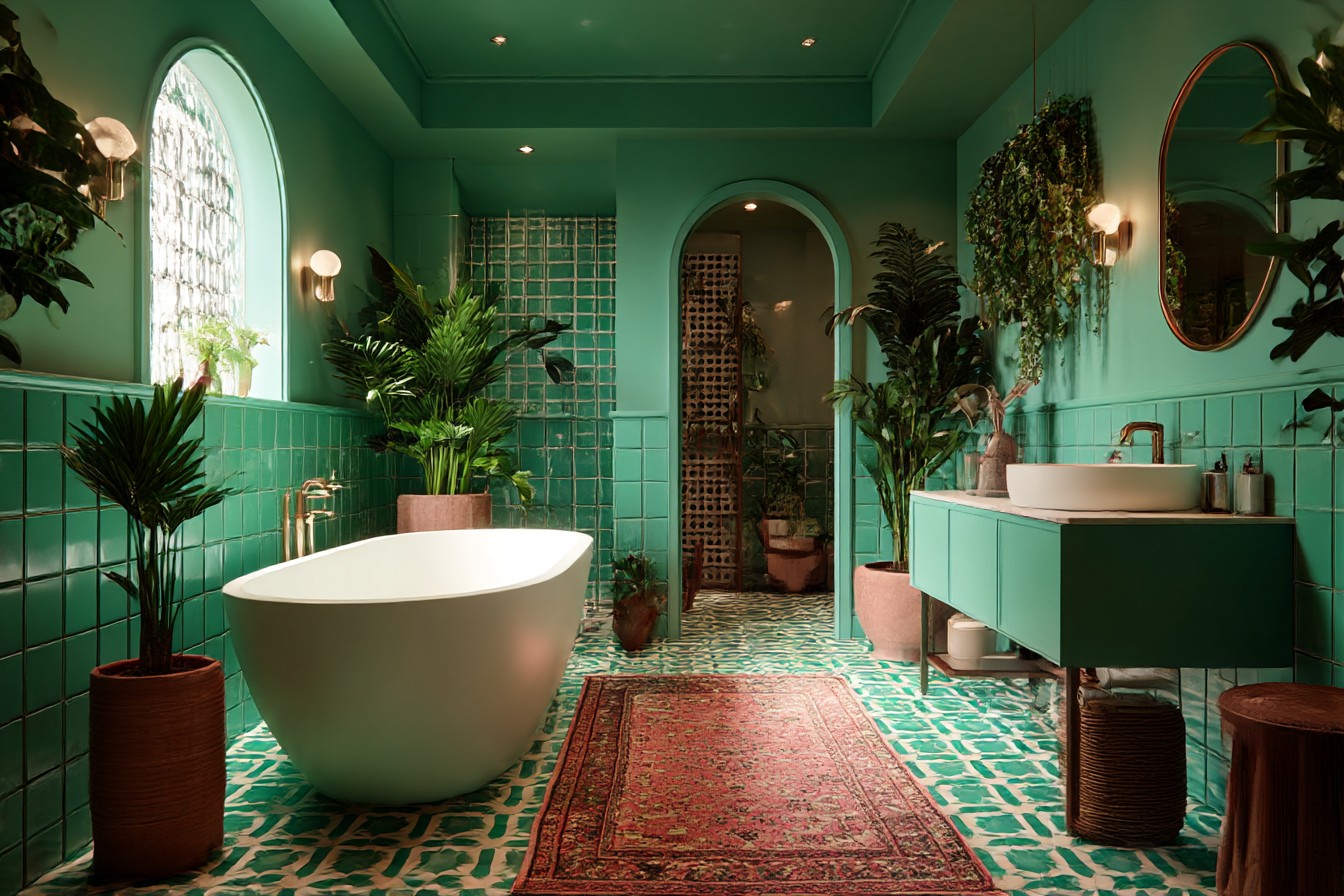
One colour that completely surprised me was sage green. I was dead against it initially because green bathrooms can go so wrong, can’t they? Too bright and it’s like being inside a lime. Too dark and it feels dated, like something from the eighties. But this soft, greyish sage… it’s actually incredible. Calming first thing in the morning (which frankly we all need), makes white fixtures look crisp and clean, and somehow tricks people into thinking you’ve spent more money than you have.
I painted my sister’s downstairs loo this colour about eighteen months ago she was terrified I was going mental with the paint choices, but she trusted me because I’d sorted out her living room quite successfully. Now every single person who uses that loo comments on how “spa-like” it feels. Works beautifully with her brass mirror from Next and the white subway tiles, but I’ve seen photos online of the same colour working with chrome and marble as well.
Here’s something nobody warns you about when you’re choosing bathroom paint it needs to cope with real life. Steam from showers, toothpaste splatters, that mysterious bathroom grime that appears from nowhere. Some colours show every mark, others seem to hide imperfections. Generally speaking, lighter colours are more forgiving, but there are definitely exceptions.
Soft blues can work really well, but you’ve got to be careful not to go too blue. I’m talking about colours so subtle you might think they’re grey in certain lights. These work especially well if you’ve got white fixtures because they enhance that fresh, clean feeling without making the whole room look themed. The key is avoiding anything that screams “seaside cottage” unless that’s specifically what you’re going for.
One approach that’s never failed me is doing most of the walls in warm white and then painting just one wall in a slightly deeper tone. Maybe soft mushroom grey behind the mirror, or that sage green on the wall with the towel rail. Gives you visual interest without committing to colour everywhere, which can feel a bit overwhelming in a small space.
The colours I absolutely avoid? Anything too trendy remember when everyone was obsessed with that particular shade of duck egg blue? Or anything that only looks good in perfect conditions. Life’s stressful enough without your paint choices adding to the morning chaos.
I’ve also learned that the paint finish matters almost as much as the colour itself. Semi-gloss or satin finishes are brilliant in bathrooms because they handle moisture better and wipe clean easily when not if, when you end up with toothpaste on the walls. Yes, they show up imperfections in your wall prep more than matt paint, but honestly, the easy cleaning makes it worth the extra effort with the preparation.
The colours that have really stood the test of time in my experience are the ones that don’t demand attention. They’re like good underwear doing their job perfectly without anyone really noticing. They make whatever you bring to the space look better towels, artwork, plants, that fancy hand soap you bought yourself as a treat without competing for attention.
After years of experimenting, repainting disasters, and living with both brilliant choices and complete failures, I keep coming back to colours that feel effortless. The kind that make people say “ooh, what’s that paint colour?” not because it’s bold or dramatic, but because the whole room just feels right. That’s what you’re aiming for colours so well-chosen they become invisible, quietly making everything else look more expensive and put-together than it actually was.