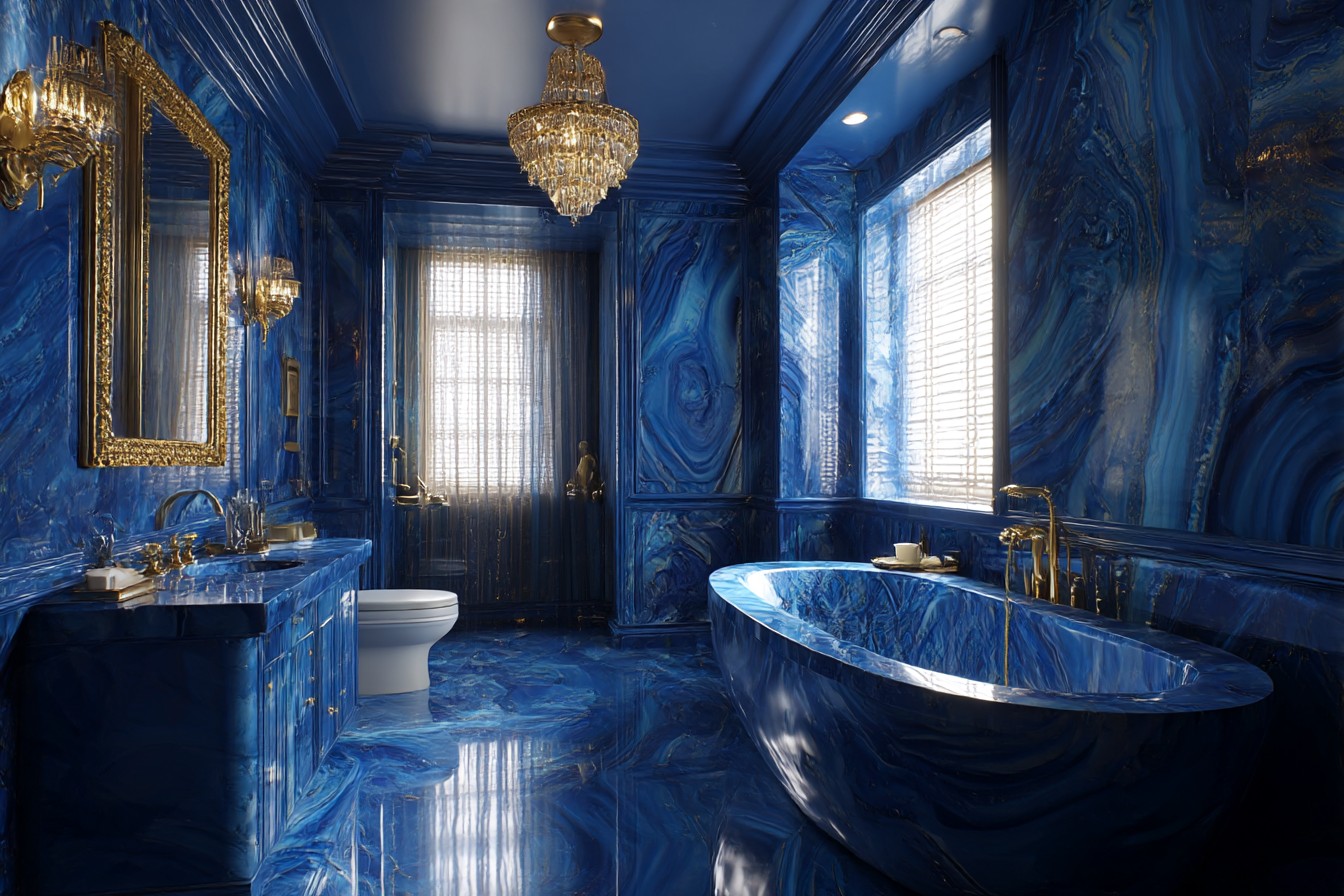
I’m standing in my bathroom at half past six in the morning, electric toothbrush buzzing away, looking at these blue walls that I painted three years ago when I was going through my whole “make this flat actually liveable” phase. The colour’s called Heron Blue – picked it from about fifteen different samples I’d stuck to the wall and obsessed over for weeks. It’s this soft greyish-blue that changes completely depending on the light. Rainy Manchester morning? Looks moody and sophisticated. Sunny afternoon? Suddenly it’s this calming, spa-like thing.
My mum still doesn’t get it. “Why blue in a bathroom?” she asked when she first saw it. “Isn’t that a bit… predictable?” But honestly, three years later and I’m still not tired of it. Not even slightly.
The thing is, I nearly didn’t go with blue at all. My original plan was white walls because that’s what you do in small spaces, right? Keep everything light and bright. But my tiny new-build bathroom already felt like a sterile box, and more white wasn’t going to fix that problem. So I started researching colour psychology – yeah, I know, proper software developer approach to choosing paint – and kept coming back to blue for bathrooms.
Took me ages to find the right shade though. The first sample I tried was this bright, almost turquoise thing that made me feel like I was inside a swimming pool. Too much. The second was so grey it was basically just sad – like a cloudy day that never ends, as my mate Dev put it when he came round to see the disaster. Heron Blue was actually my third attempt, and when I painted the sample square it just worked. Cool enough to make the space feel bigger than its actual tiny dimensions, but with enough warmth that it didn’t feel cold against the white suite.
Here’s what I learned though – blue walls mean nothing if you mess up everything else around them. My first attempt at decorating this space was basically blue walls plus white everything. White towels, white shower curtain, white toilet roll holder, white soap dispenser. Looked like a budget hotel. Actually worse than a budget hotel because at least they usually have some kind of personality, even if it’s terrible personality.
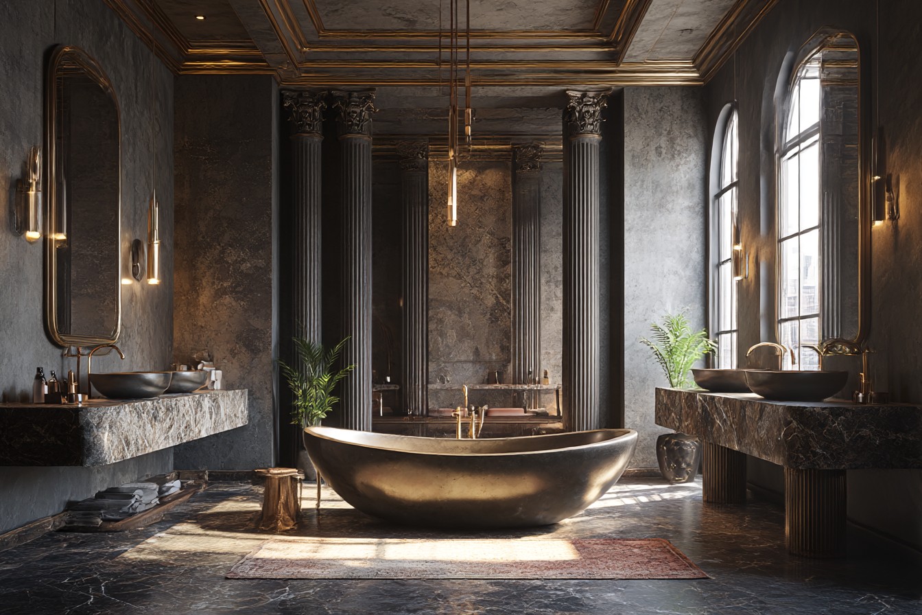
The breakthrough came when I swapped out all the chrome fixtures for brass ones. Cost me about £160 all in – new towel rails, toilet roll holder, mirror, cabinet handles. Sounds like a lot for what’s essentially shiny metal things, but the difference was incredible. That warm brass against the blue suddenly made everything look intentional instead of accidental. Like I’d actually thought about how colours work together instead of just slapping paint on walls and hoping for the best.
Then I found this vintage Persian rug at an estate sale in Chorlton – twenty-eight quid for something that probably cost hundreds originally. Deep burgundy and cream pattern, bit worn in places but that just adds character. My girlfriend thought I was mad putting a proper rug in a bathroom, but it’s been fine. Adds this unexpected warmth and stops the room feeling too clinical.
The shower curtain was another game changer. I’d been using this plastic thing from Wilko that did the job but looked cheap. Found a linen one online – bit more expensive but the texture is gorgeous and it makes the whole space feel more grown up. Natural fibres in bathrooms always feel a bit luxurious, like you’re staying somewhere fancy instead of getting ready for another day of debugging code.
Storage’s been crucial for keeping things looking good rather than just functional. Put up some floating shelves in oak to match the vanity, and I’m probably too obsessive about what goes on them. Everything gets transferred into glass jars or ceramic containers – no bright plastic bottles or random packaging. Takes about five extra minutes when I’m restocking stuff but it’s worth it for the visual calm. My spreadsheet brain appreciates the organisation anyway.
Lighting took me months to get right. The original fixture was one of those harsh circular LED things that made everything look washed out and clinical. Now I’ve got softer overhead lighting plus two sconces either side of the mirror. The sconces bounce light up and down rather than just blasting it straight at you, which makes the blue walls actually glow instead of looking flat.
Plants have been essential. Blue can feel quite cold and masculine if you’re not careful, so I’ve got a small fiddle leaf fig in the corner – they actually handle bathroom humidity fine if you’ve got decent ventilation, which thankfully this flat does. I rotate smaller plants on the shelves too. Currently it’s a snake plant and some trailing pothos that’s doing surprisingly well. The green creates this nice bridge between the cool walls and the warm wood and brass.
One mistake I see everywhere online is too much blue. Blue walls, blue towels, blue accessories, blue everything. It becomes monotonous really quickly. I use blue as the foundation but layer in other colours and textures. My towels are cream with subtle stripes, bath mat’s natural jute, and I’ve got actual art on the walls – small pieces with warm tones that complement rather than compete with the blue.
The downstairs loo is painted in a deeper navy now because I wanted to experiment with darker blues. Works brilliantly in that tiny space – feels dramatic rather than claustrophobic. Kept everything else light though – white subway tiles, brass fixtures, big mirror to reflect light from the hallway.
What keeps it interesting after three years is treating the blue as a backdrop rather than the main event. The walls set the mood, but the brass and wood and plants and textiles create the actual personality. I can swap out accessories, change the art, bring in different plants, and the space evolves while keeping that calm foundation.
My parents still think I’m slightly mad for caring this much about bathroom decor – “it’s just for washing,” as my dad says – but every morning when I’m standing there half asleep, these walls still make me smile. Not because I’m a morning person, definitely not that, but because the space feels intentional and calm and mine. After three years of developer flat living, that’s worth more than any trendy colour that’ll look dated next year.