I’ll be honest – for the longest time, I thought putting art in the bathroom was a bit pretentious. Like, it’s where you brush your teeth and have a wee, not the National Gallery. But after eighteen years of rushing through morning routines in bland, magnolia-walled hospital staff loos, I craved something… nicer when I got home. Just something that didn’t make me feel like I was still at work, you know?
The lightbulb moment happened in the most random way. Phil and I had booked this little cottage in the Peak District for a long weekend – nothing fancy, just needed to get away after I’d had a particularly rough week on the ward. The bathroom was absolutely tiny, probably smaller than most people’s wardrobes, but whoever had stayed there before had stuck three small framed pictures on the wall. Watercolours of local birds – a robin, a bluetit, something else I couldn’t identify. Probably cost about a tenner each from a craft fair.
But sitting there each morning (you know how it is), instead of staring at blank walls or checking my phone, I found myself actually looking at these little paintings. There was something so calming about it. Made the whole cramped space feel less utilitarian and more… I don’t know, human? When we got home to our own bathroom with its boring white walls and basic mirror, the contrast was depressing.
That’s when I decided our bathroom needed some personality too. And blimey, did I learn some lessons the hard way.
First disaster: I bought this lovely botanical print from a market stall – beautiful green fern illustration that I thought would look gorgeous in our white bathroom. Popped it in a cheap wooden frame from Wilko (about eight quid), hung it on the wall opposite the sink, felt very pleased with myself. Within a month, the frame was falling apart. The corners had separated, the backing was all warped and bubbly, the whole thing looked like it had been left out in the rain.
Turns out, bathrooms are basically humidity chambers and not all frames cope well with that. Who knew? I mean, I should have known – I’d seen enough moisture damage in hospital changing rooms over the years. But somehow it didn’t click that my bathroom at home would have the same issues.
Now I’m much more careful about materials. Metal frames work brilliantly – I’ve got aluminum ones that still look perfect after two years of daily showers. They cost more (we’re talking twenty-five to forty pounds instead of under ten), but they actually last. I’ve also found some sealed wooden frames with proper moisture barriers that work well, though they’re pricier too.
The hanging situation was another learning curve. I was terrified of drilling holes in our bathroom tiles – partly because I didn’t want to crack anything, partly because Phil would have killed me if I’d hit a water pipe. Started using those Command strips designed for humid environments, and they’re actually brilliant. I was skeptical at first because it seemed too easy, but I’ve had prints hanging for ages now with no slipping or falling off.
For the heavier pieces, I did eventually bite the bullet and drill proper holes with wall plugs, but honestly most bathroom art doesn’t need to be that substantial. The 3M hooks rated for a couple of pounds each handle most framed pictures just fine.
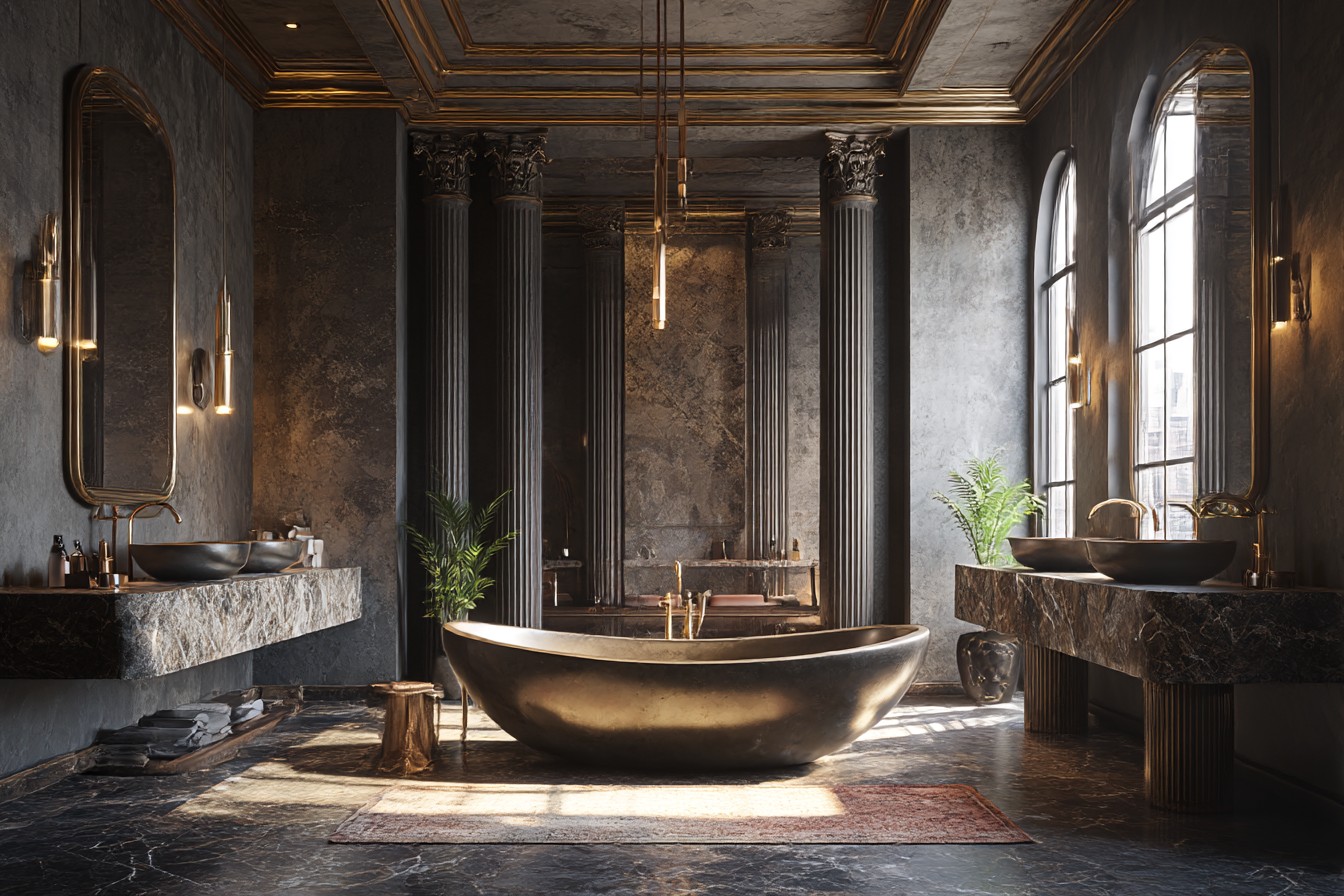
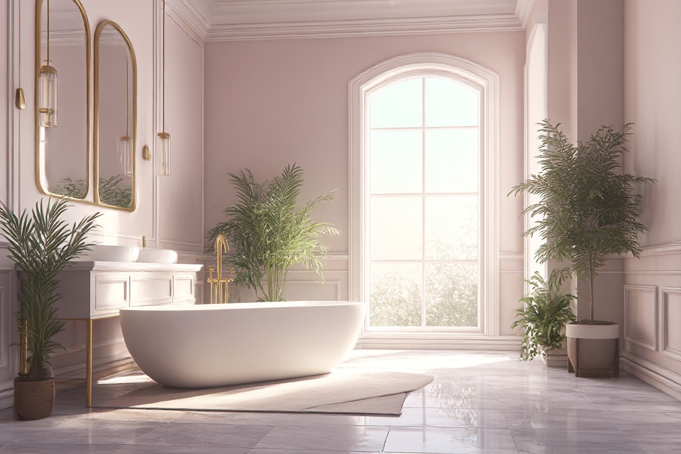
Size was something else I got wrong initially. Our bathroom has these large white subway tiles that I love, and I thought a gallery wall of small prints would look sophisticated. Massive mistake. They looked like tiny postage stamps floating on this expanse of white tiling. Now I go for fewer, larger pieces – maybe one substantial print or two medium-sized ones maximum per wall. Much better impact.
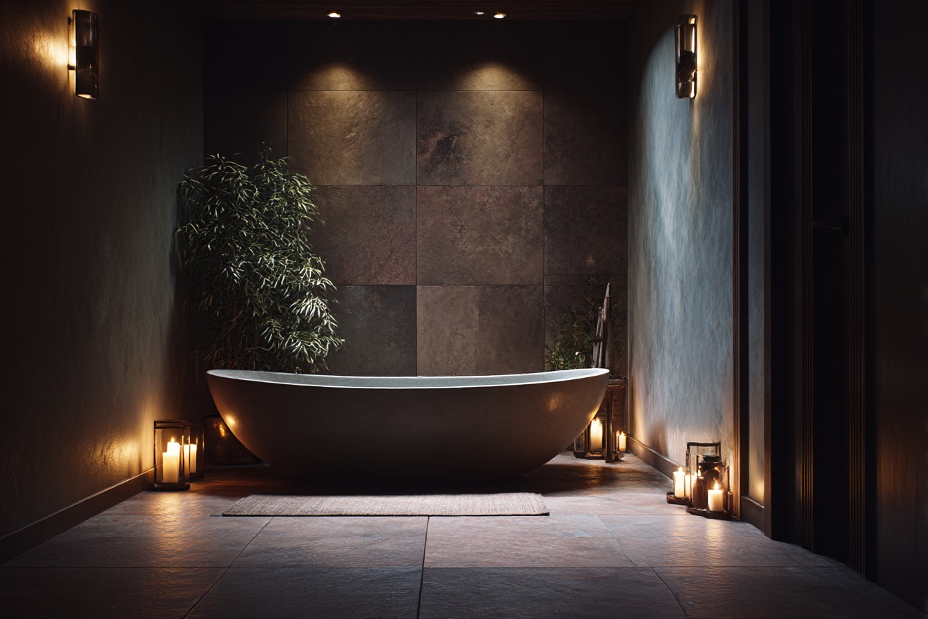
The subject matter took some experimenting too. I tried abstract geometric prints first, thinking they’d feel clean and modern, but they were too harsh against all the soft curves of the basin and bathtub. What works much better is photography, especially black and white images with gentle contrast rather than stark dramatic ones.
I’ve got this gorgeous shot of sand dunes that I picked up at a photography exhibition in Leeds – cost about twenty pounds and it brings this lovely sense of calm texture to the space. The photographer was selling off some of her older work, and this piece just spoke to me. It has these subtle beige and gray tones that somehow make the whole bathroom feel more spa-like.
Botanical prints are a bit obvious, but they genuinely work if you choose carefully. I avoid anything too busy or bright – those overly colorful flower prints can make a small space feel chaotic. Instead, I lean toward simple line drawings or those vintage-style naturalist illustrations. There’s this beautiful Victorian fern print that I found as a reproduction online and had properly framed – total cost about thirty-five pounds – and it feels like it belongs rather than just being stuck on the wall for decoration’s sake.
One thing that absolutely doesn’t work, and I learned this the embarrassing way: family photos. I thought it would add personality, hung a nice picture of Phil and me from our wedding. But there’s something deeply weird about your husband’s face watching you in the bath. Moved that to the hallway pretty quickly.
Color coordination makes everything feel intentional rather than random. Since our bathroom is mainly white with chrome fixtures, I stick to black and white images or very muted tones – soft greens, warm grays, the occasional hint of blue. The sand dune photo has these lovely subtle beige tones that echo this natural stone soap dispenser I found at a pottery market. It’s those tiny connections that make a room feel considered rather than thrown together.
Lighting makes a huge difference too, something I didn’t think about initially. Our main bathroom light is quite harsh (aren’t they all?), and it was making the pictures look flat and creating odd shadows. I added two small LED picture lights – battery-operated ones that attach right to the frame tops. About fifteen pounds each, and they completely transformed how the images look, especially in the evenings when I want the space to feel relaxing.
The moisture issue goes beyond just frames, by the way. I noticed one of my prints was getting tiny water spots on the glass, even though it wasn’t directly in the shower spray zone. Now I’m more strategic about positioning – artwork goes well away from the shower area, and I actually run a small dehumidifier during the steamier months. Sounds excessive, but it keeps everything looking pristine and the whole room feels fresher.
Practical considerations matter too. I initially wanted to hang a series of three matching prints above the sink, but they would have blocked access to our medicine cabinet. Had to rethink the whole layout and move them to the opposite wall where they’re still visible but don’t interfere with daily routines. Function first, always.
The best thing I did was test everything before making it permanent. I used removable strips to try different positions and lived with them for a couple of weeks before committing to proper hanging. What looks gorgeous when you’re in decorating mode might drive you absolutely mad when you’re rushing to get ready for work.
Our bathroom feels like an actual room now rather than just a functional space. Three carefully chosen pieces, properly positioned and lit, have transformed those daily moments from mundane rushing about to something actually pleasant. And for maybe a hundred pounds total investment and a bit of planning time, that feels like money well spent. Who would have thought that something as simple as pictures on bathroom walls could make such a difference to how you start and end each day?