Right, so picture this: me, stood in my matchbox-sized downstairs toilet last month, holding what can only be described as the most aggressively geometric wallpaper known to mankind, wondering if I’d finally cracked. You know that feeling when you’re holding something that looks like it could trigger an epileptic fit, questioning whether you’ve completely lost the plot? Yeah, that was Tuesday afternoon for me.
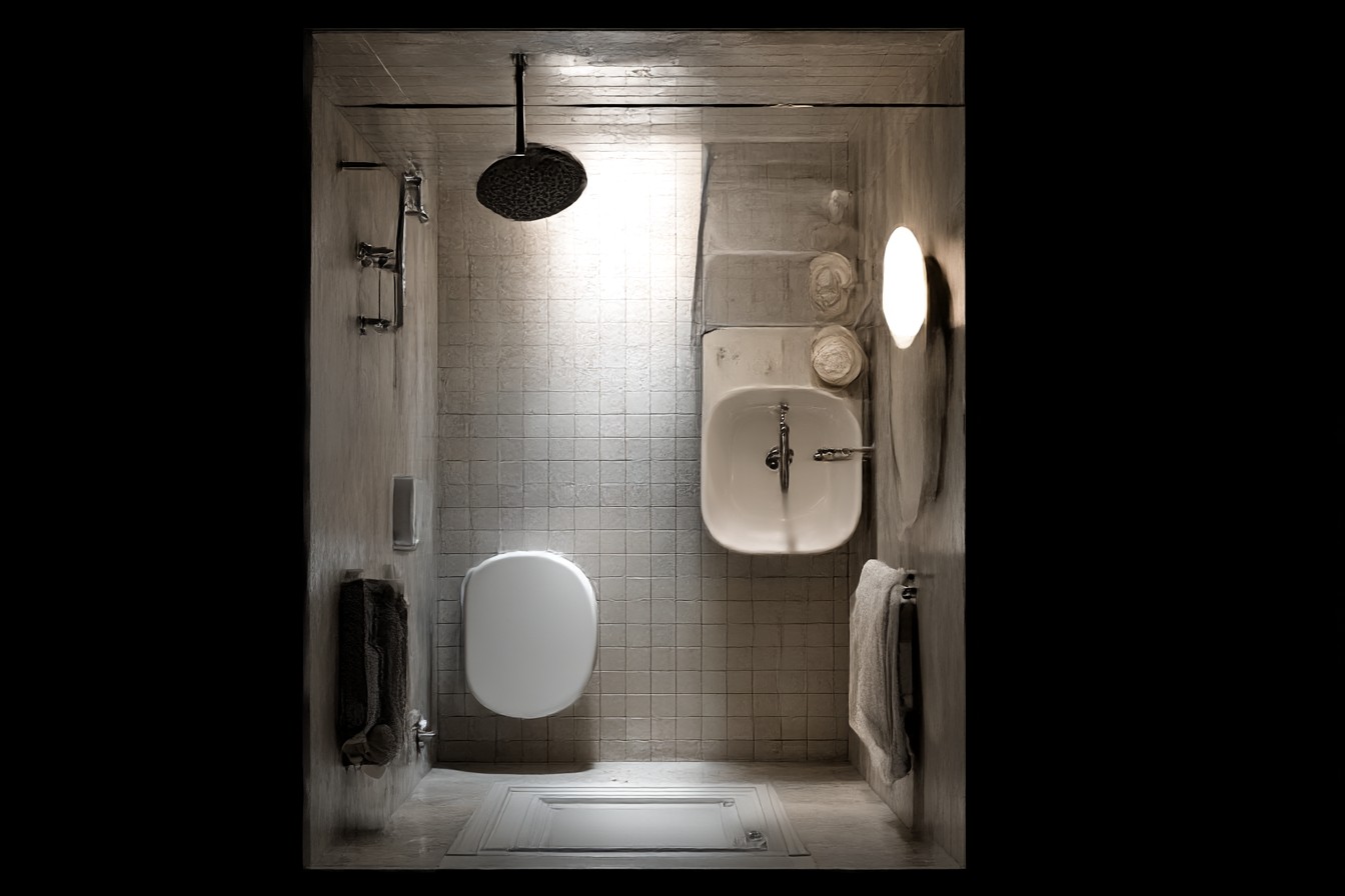
The thing is, my downstairs loo is absolutely tiny. I’m talking proper small – you can literally touch both walls while sitting down, which probably isn’t the most dignified admission I’ll make today, but there we are. It’s one of those spaces that developers squeeze in because they have to, not because they want to.
For ages, I bought into this complete nonsense that small spaces need to be safe. Beige walls, white everything, maybe a mirror if we’re feeling particularly rebellious. My mum still thinks this way – she’s convinced that anything other than magnolia paint in a small room is asking for trouble. “It’ll make it look even smaller,” she says every time I show her what I’ve been up to.
What absolute rubbish, honestly.
I started messing about with wallpaper in small bathrooms maybe two years ago, got properly fed up with staring at walls that made me feel like I was trapped inside a particularly boring vanilla dessert. My first attempt was this botanical print – tiny leaves in soft green on cream background. Found it in this discount wallpaper shop that permanently smelled of cigarettes and broken dreams, cost me £28 for two rolls.
The difference was mental. Suddenly my cramped bathroom had personality, something interesting to look at besides my own reflection (why do I always look startled in bathroom mirrors? It’s like I’m permanently surprised to find myself there).
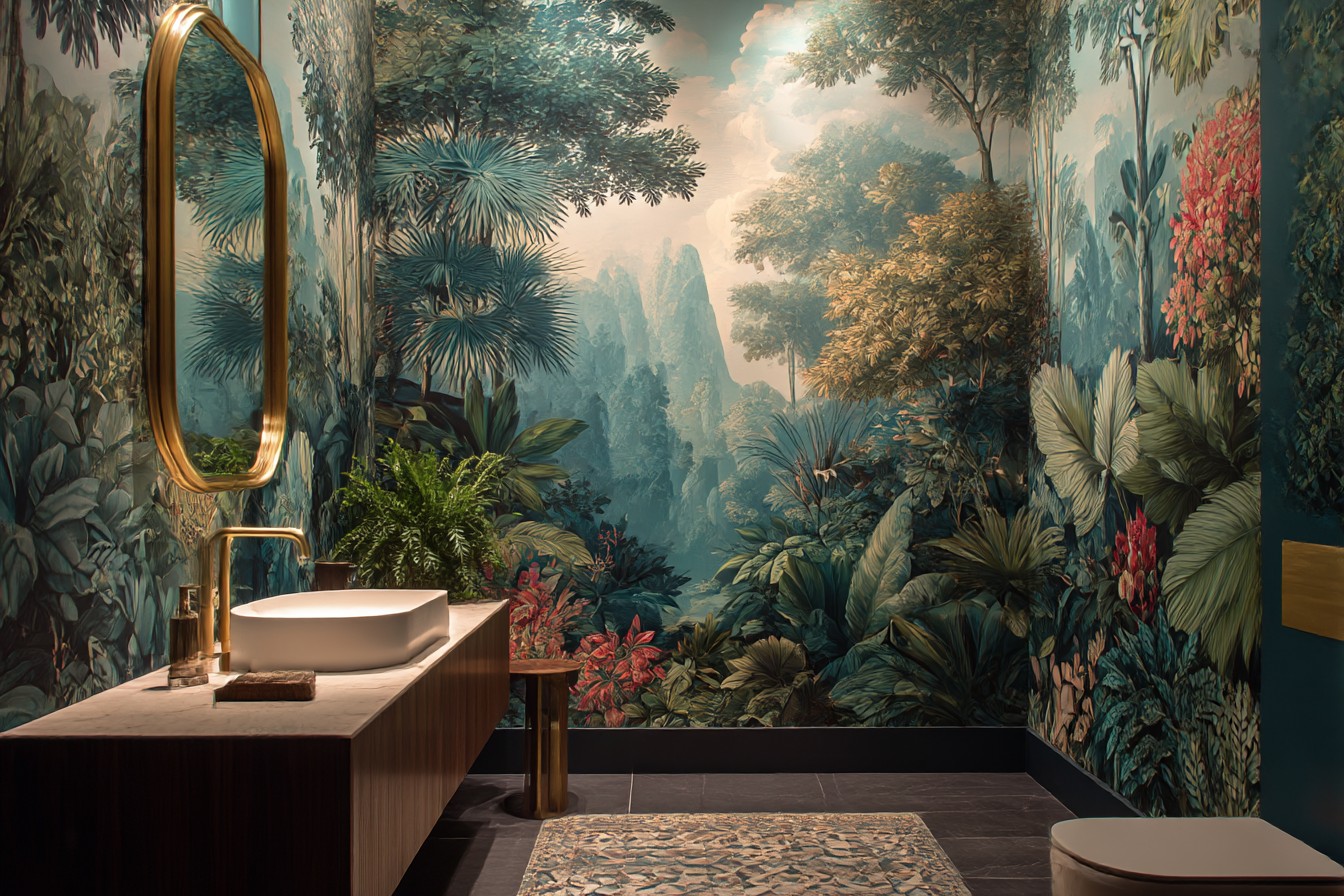
But here’s where I messed up initially – scale is everything in tiny bathrooms, probably more than anywhere else. My first proper disaster was this gorgeous damask print I bought without thinking. The roses were massive, clearly designed for some grand Victorian parlour, definitely not meant for a space where you can’t stretch your arms without hitting something. It was like being trapped inside my nan’s old curtains. Not exactly the relaxing bathroom experience I was going for.
It’s not just about the size of individual bits though – it’s about how busy everything feels when you’re stuck in there. Made this mistake with a geometric hexagon pattern that looked brilliant as a sample. Clean, modern, perfectly sized. But wallpapered the whole space? Couldn’t work out where to look. Every surface was having a row with the others. Like being inside a kaleidoscope that was having some sort of breakdown.
The lightbulb moment came when I stopped thinking about wallpaper as something you just stick everywhere and started being strategic about it. One wall – usually behind the toilet or sink – can handle pattern while everything else stays calm. Gives you visual interest without making your eyes want to escape. Plus it’s cheaper, which definitely matters when you’re not exactly rolling in renovation cash.
Everyone bangs on about light colours making spaces feel bigger, which is true I suppose, but that’s not really the point. Light backgrounds let you get away with more detailed patterns. Got this trailing ivy print now that’s quite busy when you look closely, but because it’s soft grey on white, it just looks like interesting texture rather than complete chaos.
The moisture thing though – that’s properly important and I learned this the hard way. Had this beautiful grasscloth-effect paper that started peeling after about six weeks. All that steam from showers, temperature changes, the odd splash when you’re brushing your teeth – bathroom wallpaper takes a proper beating. You need vinyl-backed stuff or papers specifically made for bathrooms. Costs more upfront but saves you from having to redo everything when it starts curling at the edges like some sad sandwich.
Here’s something nobody talks about – cleaning matters way more than you’d think. Intricate patterns might look incredible in the shop, but if you can’t tell when they need a wipe down, you’ll end up with grimy wallpaper that’s pretending to be decorative. Simple, regular patterns are much better for actual living. Those tiny polka dots I tried once? Complete nightmare. Every water spot showed up like a beacon. The subtle stripes I replaced them with? So much more forgiving.
Vertical stripes actually do make low ceilings feel higher, by the way. Sounds like complete design magazine nonsense until you try it. My bathroom ceiling is probably seven and a half feet on a good day. Added these narrow vertical stripes in pale blue and suddenly it felt less like a cave. Key thing is keeping them subtle though – tone-on-tone, not something that belongs in a circus.
One thing that’s worked brilliantly: removable wallpaper when you’re renting or just not ready to commit. Tried this peel-and-stick version with delicate ferns for my mate Sarah’s rental. Looked expensive, went up in an afternoon, came down clean when she moved out. Not quite the same quality as proper wallpaper, but perfect for testing whether you can actually live with a pattern long-term.
Biggest mistake I see people make? Choosing patterns because they look nice in isolation rather than thinking about actually using the space. You’re not just decorating a wall – you’re creating somewhere you’ll brush your teeth, sort your hair out, maybe scroll through your phone for longer than you’d ever admit to anyone (we all do it). The pattern needs to be calm enough for daily stuff but interesting enough that you don’t get bored staring at it.
Texture adds loads without needing dramatic colours or mental prints. Got this subtle linen-look paper last month that gives the walls proper dimension and warmth without shouting about it. Costs about the same as flat paper but feels so much richer.
My approach now: pair patterned wallpaper with other bits that make the small space feel intentional rather than just cramped. Good lighting is massive – warm LEDs, not those horrible daylight bulbs that make everyone look like extras from a zombie film. Maybe a small plant if you’ve got a window. Even just swapping the standard cabinet handles for something with a bit of personality makes a difference.
The truth about wallpaper in tiny bathrooms? It’s not really about making the space look bigger – it’s about making it feel like it’s actually yours. My downstairs loo might still be the size of a generous cupboard, but at least now when I’m touching both walls while sitting down, I’m looking at something I chose, something that makes me smile rather than wonder why I’m living in a beige box.
And that geometric wallpaper I was clutching last Tuesday, questioning my sanity? It’s going up next weekend. Sometimes you’ve just got to embrace the madness.