Okay. So, I am going to explain why I did a total 180 on dark bathrooms. Honestly, I used to think they were totally nuts. Who wants to wash their face in a cave? But three years ago I was stuck in a rental property while we were doing some repairs on our house and the bathroom was God just terrible. All white and sterile with fluorescent light strips that made me look like I was suffering from some sort of illness. Each morning I felt like I was undergoing some sort of medical examination rather than preparing for my day.
I had been looking at interior designers on Instagram (the most dangerous territory when you are a former nurse with a lot of time on your hands and you have a lot of strong feelings about spaces) and I saw these beautiful dark, moody bathrooms that looked like they belonged in a high-end hotel. Places where you’d want to linger in the bathtub rather than rushing through your morning routine. But I was scared stiff of the whole idea I was worried that I would mess it up. What if it was like a dungeon?
So, when we finally moved back into our own home, I decided our downstairs loo would be my test subject. The space is small and it’s not used frequently. If I totally messed it up, we could live with the results while I tried to figure out how to correct it. I immediately purchased the Farrow & Ball’s Railings the deep, sophisticated charcoal that looked stunning in the tin. (Eighty five pounds sterling for two tins, by the way. Phil almost choked on his coffee when he saw the receipt.)
Well. The result was…intense doesn’t even come close to describing it. When I walked into that space, I felt like I was walking into a confessional booth. And not in a good way. I had created this stifling, oppressive space that made you want to enter, perform your business, and leave as quickly as possible. My sister took one look and said, “Claire, bloody hell, it looks like a Victorian mourning room in there.” (She wasn’t wrong.)
But the thing is I could see the potential. The color itself was absolutely gorgeous a rich, dramatic color that is impossible to achieve with such a bland color as Magnolia. The issue wasn’t the darkness it was all of the other factors I had neglected. Just slapping dark paint onto walls and expecting magic to occur simply isn’t going to happen. To produce a cohesive, well-designed space you have to consider how light functions, how various surfaces function, etc.
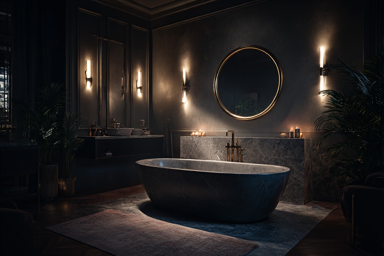
Lighting was my biggest mistake early on. We had always used those standard ceiling-mounted spotlights, but in conjunction with dark walls they were utterly useless. They produced harsh, distinct pockets of light that made the dark areas appear even darker. I spent an inordinate amount of time researching the proper bathroom lighting options (far more complex than I ever imagined there are a number of regulations surrounding electrical fixtures in bathrooms). Ultimately I installed wall sconces on either side of where a mirror would be hung.
Game-changer. Warm LED bulbs not those daylight bulbs that make you look like you are in an operating theater. Instead of producing those weird shadows that made me look like I hadn’t slept in weeks, the light dispersed evenly throughout the space. (Cost me about 120 pounds for decent sconces, but it was money well-spent for not making me feel like I was trapped in a horror movie each time I went to the loo).
A little creativity helped with a small table lamp on a floating shelf. I know this may seem crazy, but a table lamp in a bathroom produces this wonderful warm glow that changes the entire atmosphere. Of course, I had to ensure that the lamp was properly rated for bathroom use (after the first one became foggy due to shower steam). Learn from my mistakes.
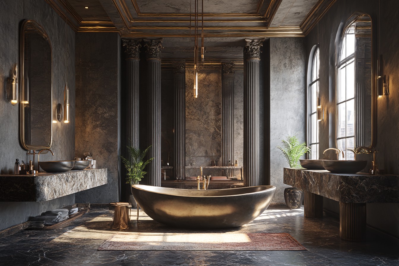
The mirror situation required fixing as well. Our old rectangular mirror simply vanished against the dark walls. I replaced it with a larger round mirror with a thin brass frame from a company in Leeds that specializes in reclaimed architectural materials. The rounded shape softens all of the sharp edges created by the rectangular tile and fixture arrangements. Additionally, it helps bounce light around, which makes the overall space feel larger. I have employed this trick in two additional spaces and it works each time.
This is also where I became somewhat obsessive about using reflective surfaces. Not in a disco-ball type of way but in terms of how every surface could assist in capturing and reflecting light. I chose tile with a slightly shiny finish rather than completely dull finishes they capture and reflect light without appearing gaudy. I even swapped out the shower door for one with minimal sparkle embedded within the glass. Nothing overly flashy just enough to prevent the space from feeling flat and uninviting.
Beyond choosing the color “everything black,” color selection proved to be another major factor. After living with that charcoal for a few months, I wanted to experiment with something new in our main bathroom upstairs. I selected Little Greene’s Hicks’ Blue this beautiful deep blue color that feels dramatic, yet not suffocating. It is dark enough to create that cozy, enveloped feeling, but has enough color to it to remain warm rather than stark.
What I learned was that balance is key. Balancing dark walls with lighter elements throughout the rest of the space. Pale gray limestone floor tiles nothing fancy, got them from a local supplier for thirty pounds per square meter. They ground the space and didn’t compete with the walls for attention. The natural variations in the stone add texture without becoming distracting. White fixtures (toilet, sink, bath) provide the necessary contrast to prevent the space from feeling like everything is vanishing into itself.
In addition to lighting, storage is a much greater concern in dark bathrooms because clutter will show against light-colored fixtures. I had floating shelves made in the same pale oak as our bathroom cabinet cost ninety pounds from a local carpenter, but they were precisely what the space needed. They contain all of our toiletries and towels and add a level of warmth that keeps the space from feeling cold and masculine.
Your towel choice may seem inconsequential, but it is not. White towels look nice against dark walls, but I personally prefer warm grays or even blush-pink. They feel like I put thought into how everything fits together rather than just grabbing whatever was cheap at John Lewis.
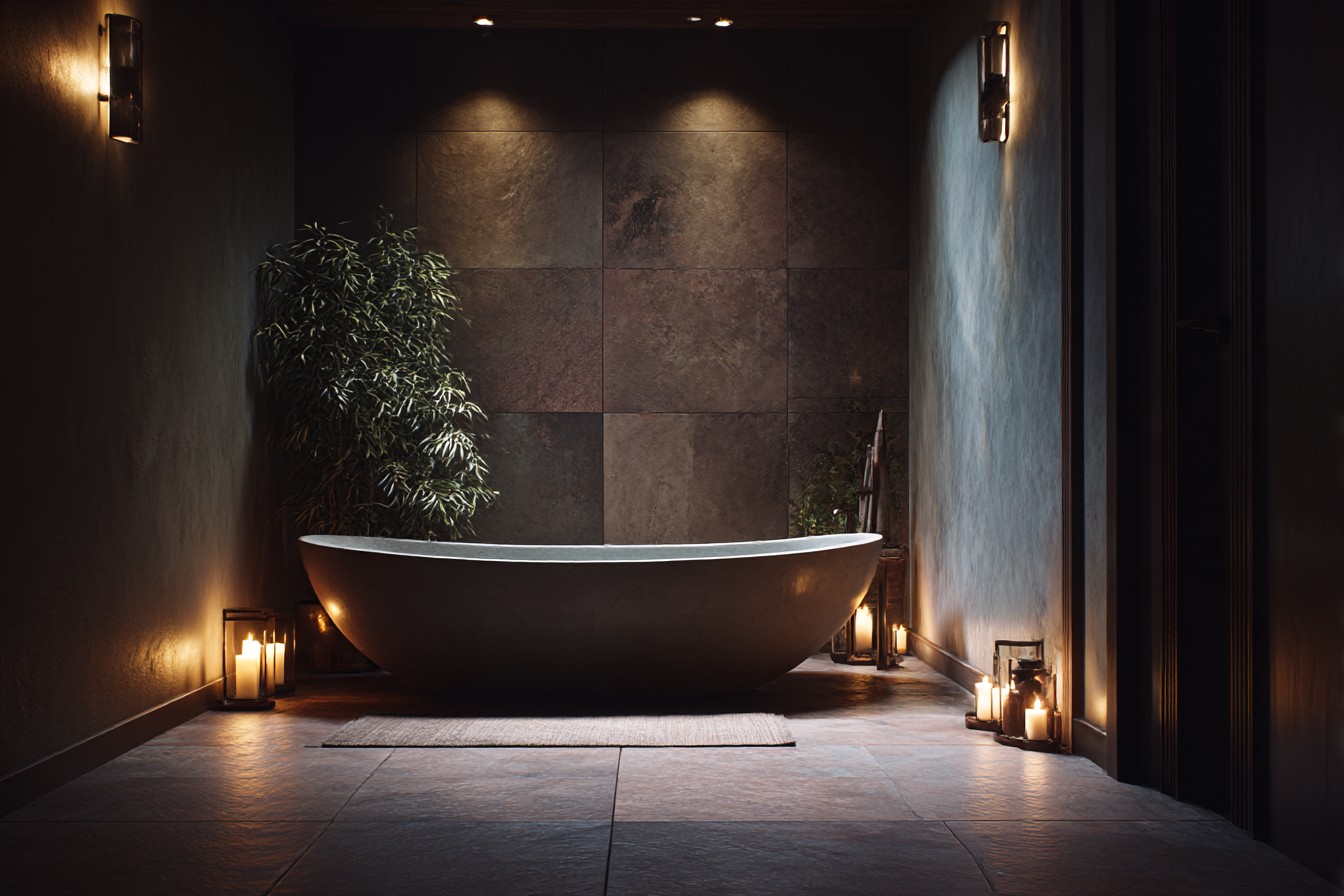
Plants are great additions to dark bathrooms provided you select plants that thrive in low-light conditions. I acquired a snake plant in a simple white ceramic pot that sits on the floor next to the tub. It thrives in low-light conditions and adds a sense of life that turns the entire room into a space where you want to linger rather than a space designed specifically for functionality. Just avoid any plants with delicate leaves the humidity in the bathroom will kill it, and nothing ruins your sophisticated bathroom aesthetic faster than dead, brown leaves.
You absolutely cannot skimp on ventilation. Mold and mildew show up like a neon sign against dark walls. Proper air circulation is not negotiable. I upgraded our exhaust fan ($80, installed it myself with the help of YouTube and a number of nervous cups of coffee), and I consistently operate it both before and after showering. Dark bathrooms are incredibly pretty, but they will not tolerate neglect.
The end result? A bathroom that feels like a luxurious retreat rather than a space where you rush through your morning routine. Everyone comments on how relaxing and “hotel-like” the space feels exactly what I was going for. It is dramatic enough to feel special each time you walk into the space, yet comfortable enough that you are not constantly reminded of the design decisions.
Absolutely. But I would skip that first black paint fiasco and go directly to navy or deep green. I would have invested in real lighting from the start rather than attempting to make do with what we already had, and I would have factored in real mirrors and reflective surfaces from day one.