Honestly, when did we all decide that bathrooms need to look like hospital corridors? I was scrolling through Pinterest the other day – procrastinating on grouting the shower if I’m being completely honest – and every single bathroom looked the same. White subway tiles, grey vanity, maybe a hint of pale blue if someone was feeling really adventurous. It’s like we’ve collectively agreed that the room where we start every morning should have all the personality of a dentist’s waiting room.
My own colour rebellion happened completely by accident, back when Danny and I were renting that grim flat in Beeston I mentioned before. The bathroom was properly depressing – you know those overhead strip lights that make everyone look like they’re about to keel over? Yeah, that. The whole room was this greige colour that somehow managed to be both beige and grey at the same time, which I didn’t even know was possible.
Our landlord, bless him, said we could decorate as long as we kept it “neutral for future tenants.” So obviously I went straight to B&Q and bought the most ridiculously bold turquoise paint I could find. Not some wishy-washy duck egg nonsense – proper Caribbean sea turquoise that made your eyes water just looking at the tin. Danny thought I’d completely lost it.
Best decision I ever made, though. Suddenly our grotty little bathroom felt like we were getting ready in some fancy beach hotel instead of a damp flat above a kebab shop. The colour made my teeth look whiter, made the dingy mirror seem brighter, and actually made me look forward to my morning routine instead of dreading it.
The really funny bit? When we moved out two years later, the landlord kept it exactly like that. Said it was the first time any of his tenants had ever made that bathroom feel welcoming. Turns out even practical middle-aged blokes from Nottingham secretly fancy a bit of joy with their morning shave.
That whole experience got me thinking about how mental we all are about bathroom colours. We spend maybe five minutes a year thinking about resale value, but we brush our teeth twice a day every single day for however many years we live somewhere. The maths just doesn’t work out, does it?
Since then I’ve gone a bit mad with bathroom experiments. Our current house has been through several colour phases, and I’ve learned loads about what actually works and what’s just Instagram nonsense. That turquoise bathroom taught me something important – colours behave completely differently depending on the light and time of day. In the morning with natural light streaming in, it felt fresh and energising. Come evening with the warm bulbs on, it turned into this gorgeous dusky blue that made even a quick face wash feel luxurious.
I’ve tried coral on a vanity unit – still my favourite experiment, looked like expensive furniture instead of flat-pack MDF. Painted our downstairs loo deep navy once, which sounds mad but actually looked dead sophisticated with white trim and brass handles. And yes, I went through a hot pink phase that lasted about three months before it started giving me headaches. Live and learn, right?
The pink disaster taught me something crucial though – there’s a difference between bold colours that energise you and bold colours that just shout at you every morning. You need to actually live with something long enough to see if it sparks joy or just becomes visual noise.
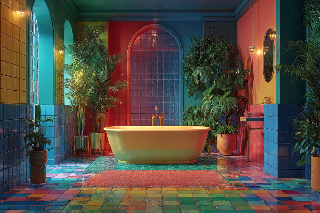
My mate Claire went even further than paint and did her whole bathroom in these incredible Portuguese tiles. Bright blues and yellows in traditional patterns that make you feel like you’ve wandered into some gorgeous café in Lisbon. Her mother-in-law nearly had a coronary – “What about when you come to sell?” – but Claire’s response was perfect: “I’m not decorating for imaginary future buyers, I’m decorating for the person who actually has to live here.”
She’s absolutely right, isn’t she? We spend so much time worrying about hypothetical house viewings that might happen in ten years’ time, meanwhile we’re miserable looking at magnolia walls every single day.
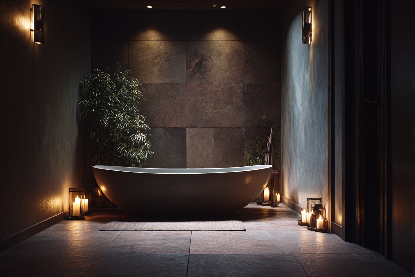
I’ve picked up some proper practical tricks over the years too. Dark colours work brilliantly in windowless bathrooms – counterintuitive, but they actually embrace the cosy cave feeling instead of trying to fight it. Always go for glossy paint with bold colours because it bounces light around better and wipes clean when you inevitably splash toothpaste everywhere. And if you’re nervous about commitment, start small – bright shower curtain, colourful towels, maybe some peel-and-stick wallpaper on one wall.
The biggest mistake I see people make – and I’ve done this myself – is choosing colours because they look good in photos rather than because they feel good to live with. That millennial pink that’s all over Instagram? Looks gorgeous in carefully staged photos with perfect lighting, but do you really want to look at yourself in that light when you’re half asleep at 6am? I’ve learned to pick colours that make me look healthy and awake, not like I need three more coffees and a holiday.
Money-wise, paint is still the cheapest way to completely transform any room. I spent about £35 on that turquoise transformation and got more compliments on it than anything else I’d ever done. Compare that to a full bathroom renovation which starts at thousands and often doesn’t give you half the emotional impact of a really good colour choice.
Right now I’m planning something that’ll probably make Danny question my sanity again – painting the ceiling of our tiny en-suite a soft peachy pink. Everyone thinks I’ve completely lost the plot, but I reckon it’ll make the morning light more flattering. And if it doesn’t work? It’s just paint, innit. I can slap some white over it in a weekend.
That’s what I love about colour experiments – they’re not actually permanent, even though we treat them like they’re tattooed onto the walls. The worst that happens is you spend a Saturday afternoon repainting, which isn’t exactly the end of the world.
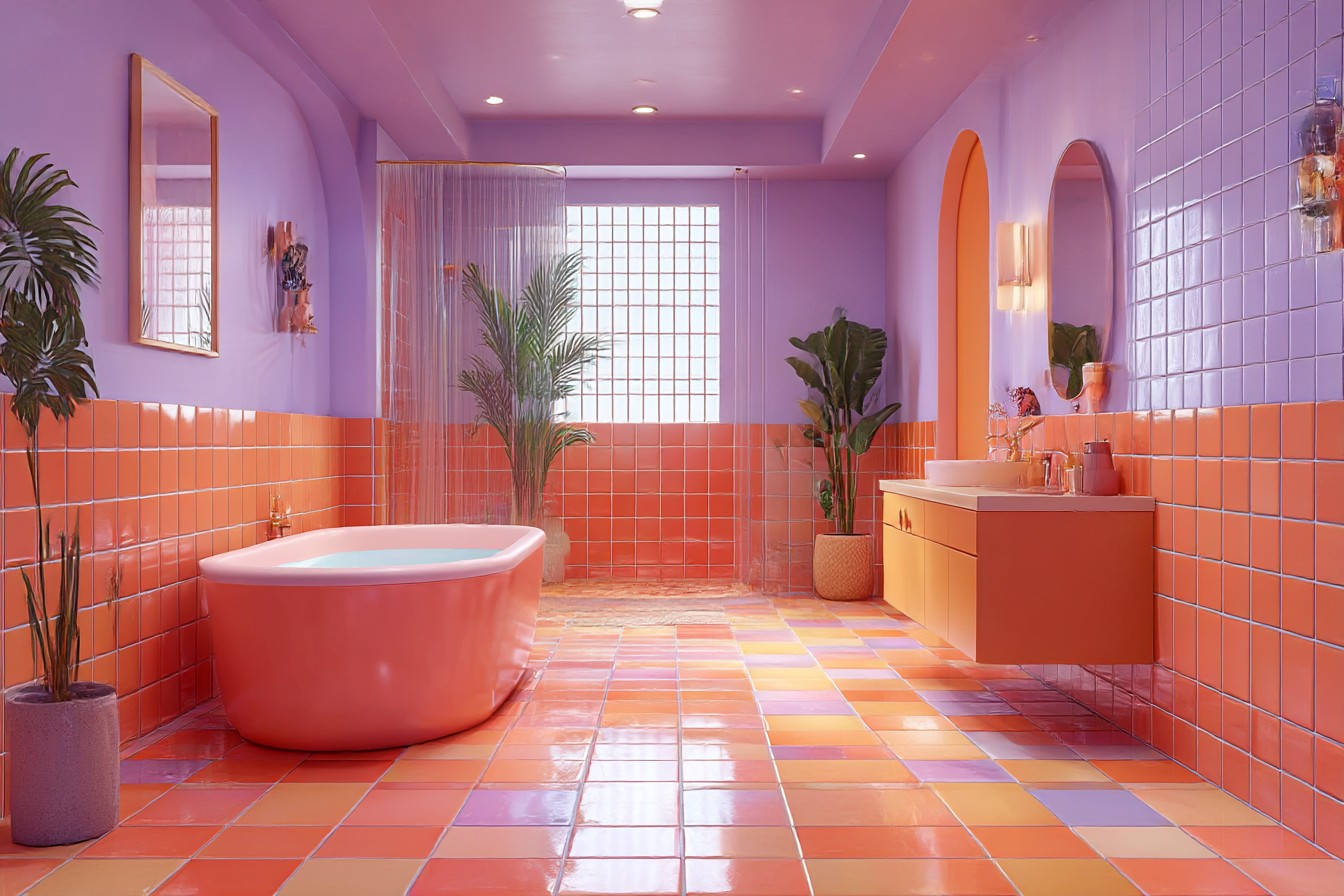
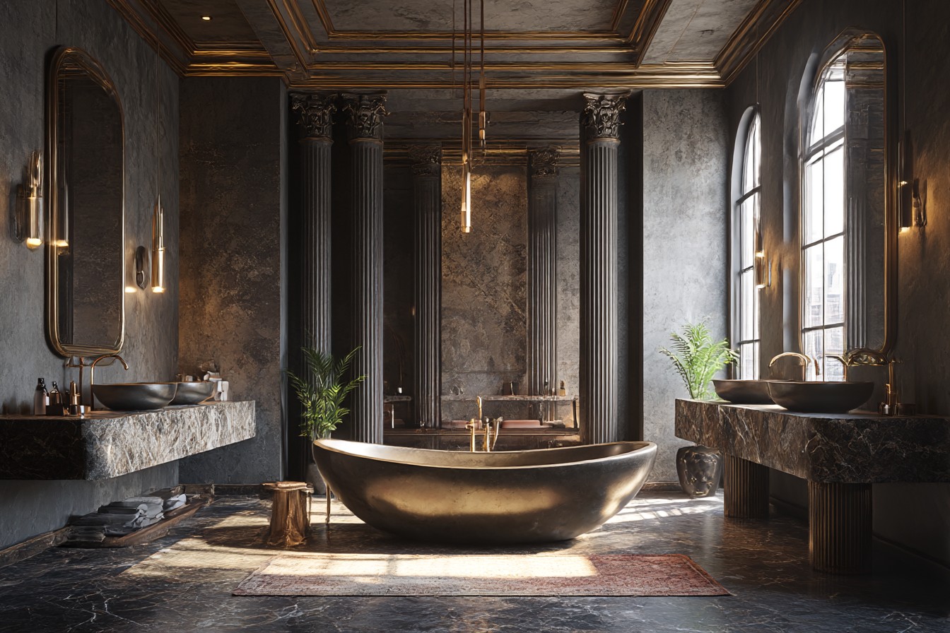
Most of the pushback I get about colourful bathrooms comes down to fear. Fear of making the “wrong” choice, fear of it looking dated, fear of what the neighbours might think. But you know what looks more dated than a bold colour choice? Playing it so ridiculously safe that your house has zero personality whatsoever. Those beige bathrooms from the early 2000s look ancient now, while my friend’s mum’s 1970s orange bathroom just looks confidently retro.
I mean, we’re talking about a room that’s maybe six feet by eight feet in most houses. If you can’t take a colour risk in your own bathroom, where can you? It’s not like you’re painting the whole house fluorescent green – though honestly, if that made you happy every morning, why not?
Life’s too short for boring bathrooms, isn’t it? You’re going to see those same walls every single day for years – they might as well make you smile instead of making you feel like you’re getting ready in a beige box.