I recently had that feeling walking into a home where you think to yourself “this is it.” That exact feeling occurred approximately 3 weeks prior to the present while exploring a stunning Edwardian-era home that was listed close to our residence. The sellers had totally renovated the upper level bathroom but left it extremely simplistic the floor was covered in black hexagon tiles; white metro tiles ran halfway up the walls; and there were these incredible brass faucets that seemed to have existed since the dawn of time, yet were clearly brand-new.
The estate agent apologized for how “simple” the bathroom was, which only fueled my desire to tell her to stop apologizing because it was truly perfect.
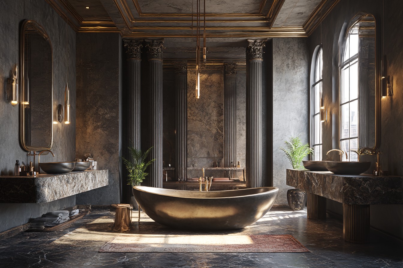
There’s just something about a black and white bathroom that will forever remain ageless. I’ve seen friends waste a small fortune attempting to chase the current trend color on Pinterest do you recall the sage green craze a few years back? Or the short-lived terracotta fad? only to become utterly exhausted of the color, eighteen months later, and then be faced with the daunting task of repainting the entire area once again. However, black and white similar to wearing jeans and a white T-shirt works with anything, never looks bad, and allows you to add as much (or as little) flair to the bathroom as you desire based on your desired atmosphere.
Although my initial attempt at creating a monochromatic bathroom was a complete disaster, I eventually developed a sense of the correct way to create a monochromatic bathroom. This was many years ago when I rented a dingy apartment in Beeston, and I had roughly £50 to work with and no idea how to design anything. I believed sophisticated was equivalent to stark, so I used builder’s white paint to cover the majority of the bathroom. In addition to using every black decorative item I could locate at Wilko, I also purchased a black shower curtain that resembled a trash bag, a black bath mat that showed every speck of lint, and even a black toilet seat that Danny still frequently uses as a method to taunt me regarding my poor design decisions. The overall aesthetic of the bathroom resembled that of a police cell.
When my mom came to visit and tactfully suggested I “maybe warm it up a bit,” I realized I’d created a black-and-white bathroom that was spectacularly incorrect.
While black and white aren’t simply colors that can be combined and expected to be visually appealing, it is a matter of achieving the ideal balance of both colors and determining where to strategically position your darker elements and lighter areas, particularly when designing a compact bathroom with limited natural light. If a bathroom is too dark, it feels like you’re bathing in a cave. Conversely, if it is too light, it resembles a dentist’s office. The optimal point of equilibrium falls somewhere in between.
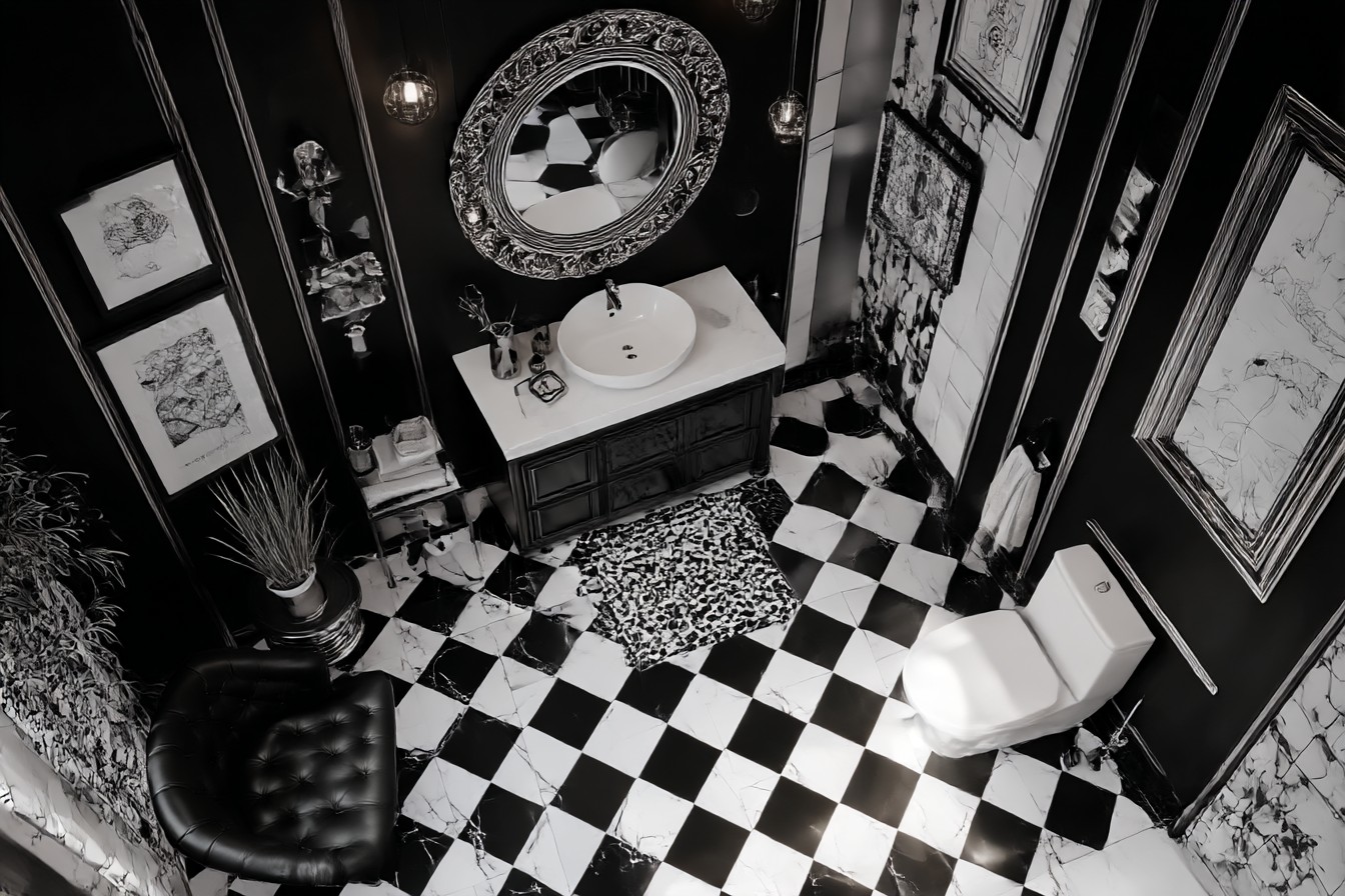
After purchasing our home and being able to renovate the bathroom, which was a horrid peach and brown nightmare that haunted my dreams, I began by selecting the flooring because that establishes the tone for the remainder of the bathroom. Although I had learned from my previous rental experience, I selected white hexagonal tile flooring with narrow black borders that run throughout. Provides a classic Victorian aesthetic without making a bold statement. Additionally, I offer the following suggestion that no one ever shares avoid using bright white grout. Seriously. I opted for light gray grout instead of bright white grout because white grout appears grimy within two weeks, and you’ll spend your lifetime cleaning it with a toothbrush in an effort to make it appear decent.
For the walls, I installed white subway tiles, but only up to about mid-torso. Similar to traditional wainscoting. For the portion above that, I painted the walls with the warmest white I could discover ultimately landed on Farrow & Ball’s Pointing after testing about 12 different shades of white on the wall and driving Danny crazy with my indecisiveness. The contrast between the glossy tile and matte paint provides an abundance of visual appeal without being overly intrusive.
Here is where I employed a strategy that I believe is a little creative I installed the vertical subway tiles. Sounds silly, I realize. However, it makes the entire room appear taller and significantly more premium. Costed the exact same amount as installing the horizontal subway tiles, however it looks ten times better. At times, the most effective techniques do not cost you any additional money.
The faucets were where I chose to have a bit of fun. I chose matte-black faucet fixtures for everything basin faucets, shower, towel rails, etc. I am aware that matte black is currently a massive trend and may feel fashionable rather than timeless; however, they photograph well and, more importantly, they do not display water marks like polished-chrome fixtures do. The rainfall-style shower head is enormous and rectangular and makes you feel as though you are in a luxury hotel. The wall-mounted basin faucets were a pain to install I had to employ a professional plumber to run the plumbing through the wall however, it results in a significant amount of additional space surrounding the sink and creates a remarkably clean and minimalist appearance.
Storage-wise, I discovered a magnificent black metal medicine cabinet with mirrored doors. I painted the interior white; therefore, when I’m half asleep and searching for ibuprofen at an ungodly hour of the morning, I can easily identify where it is. The vanity beneath the sink is white with black handles to maintain that balance didn’t wish to make it too dark and foreboding.
Lighting was probably the most difficult element to master. My first attempt was two black pendant lights that hung on either side of the mirror, appeared fantastic in the store but utterly ineffective in reality since they produced shadows in the locations I require lighting to complete my makeup or for Danny to shave without resembling he’s gone to war. I replaced them with one large black vanity light that spans the length of the mirror and a second, smaller pendant light above the tub for when I desire soft relaxation lighting.
I keep my accessories relatively basic but exchange them regularly. Sometimes I opt for sleek, polished-chrome and glass items, and other occasions I prefer warmer brass and marble. Currently, I am enamored with these white marble soap dispensers with black lettering on them, and I have this black leather tray that holds cotton balls and all the numerous tiny containers that appear to multiply when you’re not paying attention. Bath towels are white waffle towels they endure far longer than smooth cotton towels and feel more luxurious. with black trim.
Plants greatly enhance the ambiance of the bathroom. I have a snake plant on the windowsill because it thrives in humid environments and contributes the only splash of color in the bathroom. Occasionally I reward myself with white orchids from Tesco during their sales, but generally, I prefer maintaining a purely black and white bathroom.
One of the most excellent aspects of developing a solid foundation for a black and white scheme is the simplicity with which you can modify your design without commencing from the beginning. Wish to introduce some color? Include some navy blue towels or a printed shower curtain. Feel extremely minimalist? Remove everything except the essentials. Desire more texture? Include a jute bath mat or woven storage containers.
Over the course of several years, I’ve determined that timeless doesn’t necessarily imply boring it implies each and every choice you make earns its location. The hexagonal tiles earned their location due to being classic but also functional and capable of concealing stains well. The subway tiles earned their location due to being inexpensive, simple to clean, and compatible with virtually any style. The matte-black faucet fixtures earned their location due to appearing sophisticated but also not revealing water marks. None of the components were included merely for the sake of including them.