That pot of navy paint sat on my kitchen counter for about a week before I worked up the nerve to actually use it. I’d walk past it every morning making tea, giving it suspicious looks like it might somehow judge my decorating abilities. You know when you’ve committed to doing something that feels massively risky but you’re not entirely sure why? That was me with painting my bathroom blue.
I mean, I’d been staring at magnolia walls in there for nearly three years. The previous owner had clearly subscribed to the “beige everything” school of decorating, which meant my bathroom felt like the waiting room at a doctor’s surgery. Functional, sure, but hardly inspiring when you’re trying to wake up at 6:30 on a Monday morning. Every time I brushed my teeth I felt like I was in some sort of institutional limbo.
But blue felt like such a leap. What if it made the space feel freezing cold? What if it clashed horribly with those white tiles I couldn’t afford to replace? What if I hated it and had to live with my terrible decision until the next school holidays when I’d have time to fix it? Teaching salary plus mortgage doesn’t exactly leave loads of room for expensive mistakes.
Here’s what I’ve figured out after experimenting with pretty much every shade of blue you can imagine: there genuinely is one that’ll work in your space, you just need to find it. And sometimes that means testing way more colours than feels reasonable.
I started with the downstairs loo because, honestly, if I messed it up nobody would see it except me and the occasional guest. Painted just one wall in this soft blue-grey thing called “Morning Mist” or something equally ridiculous. Cost about fifteen quid for a sample pot and took me most of a Saturday afternoon because I’m still rubbish at cutting in around ceiling edges without getting paint everywhere.
The transformation was… well, I wasn’t expecting much but suddenly that tiny space felt twice the size. The soft blue made everything look cleaner somehow, less harsh than the stark white-on-magnolia situation I’d had before. Even that horrible overhead light fitting looked less offensive when it wasn’t competing with builder’s beige walls.
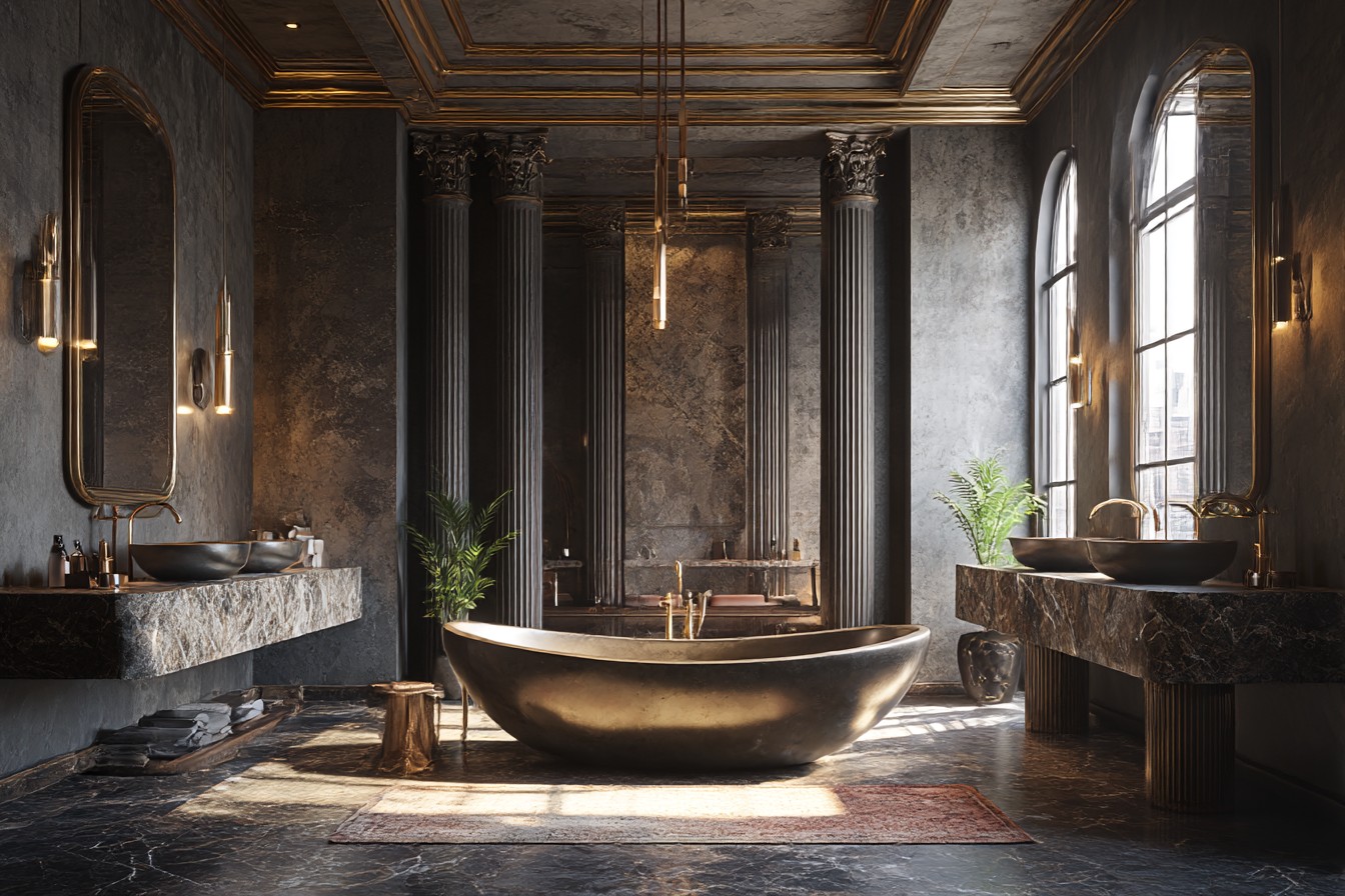
That small success gave me enough confidence to tackle the main bathroom, which desperately needed sorting anyway. The previous owner had installed this salmon pink tile around the bath area that made everyone look like they had some sort of chronic illness. Since retiling was completely out of my budget – I’d priced it up and nearly choked on my tea – I decided paint would have to do the heavy lifting.
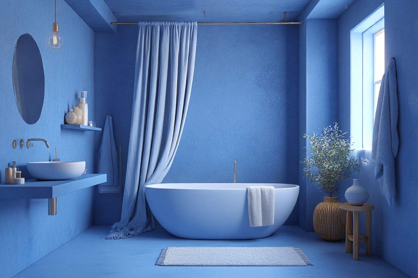
Spent ages testing different shades on various bits of wall. My girlfriend got fed up with me constantly asking “what do you think of this one?” while pointing at yet another blue rectangle. Eventually settled on something called “Coastal Storm” which sounds pretentious but actually describes it pretty well. It’s that blue-grey colour that changes completely depending on whether it’s morning or evening, bright or overcast outside.
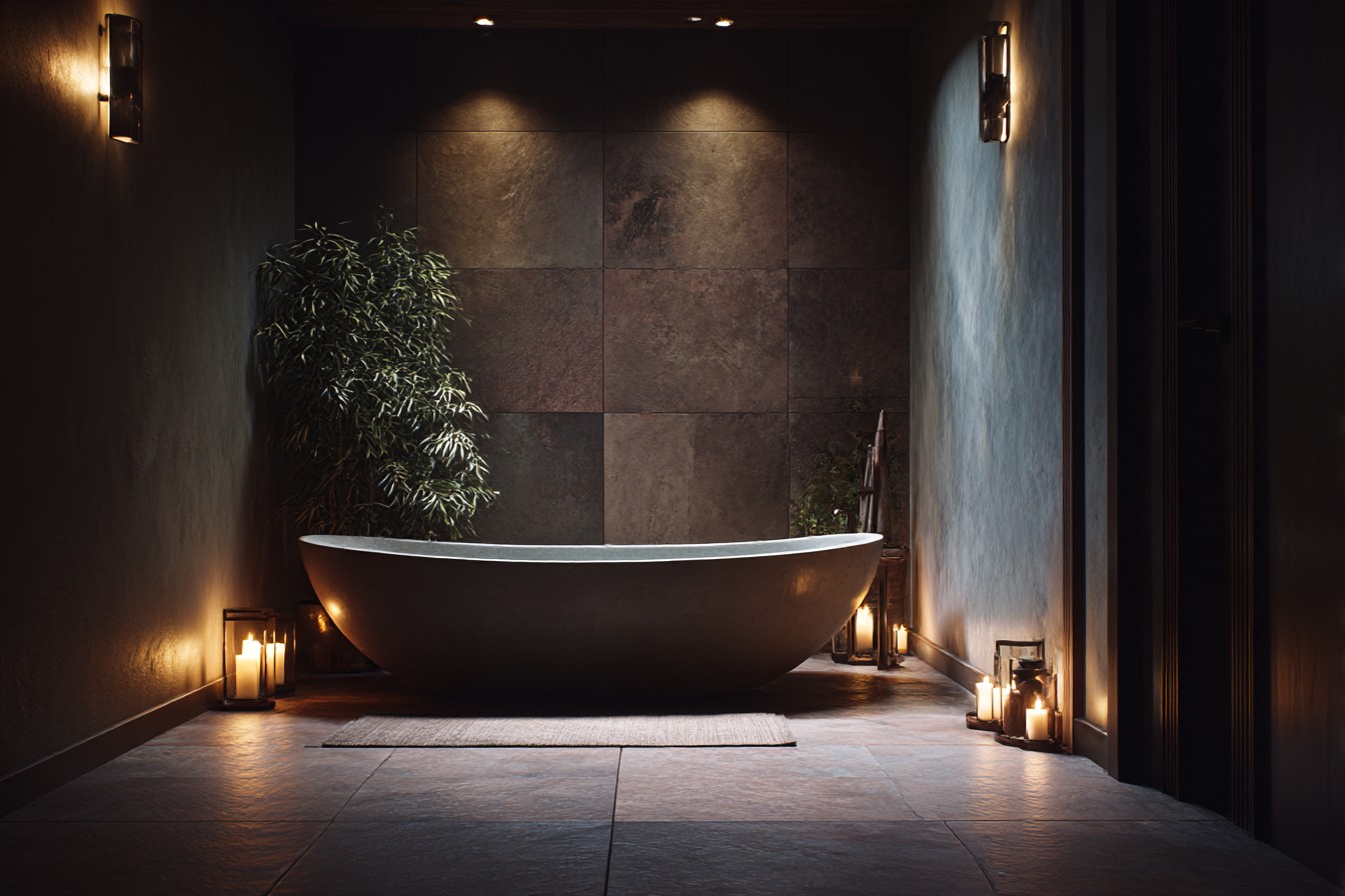
The thing nobody tells you about darker colours in bathrooms is that your lighting situation becomes absolutely critical. I learned this the hard way when my first attempt made the room feel like a cave where people went to hide from daylight. That single overhead bulb just wasn’t cutting it anymore, so I ended up installing some wall lights either side of the mirror. Got battery-operated ones from IKEA that look way more expensive than the thirty quid they actually cost.
Once the lighting was sorted, the blue really came into its own. Moody and relaxing when I’m having a bath after a particularly challenging day of trying to explain climate change to Year 9s, but fresh and energising in the morning when I need to look vaguely professional for work.
Paint isn’t the only way to get blue into a bathroom though. Some of my favourite blue elements didn’t involve committing to entire walls, which was probably wise given my track record with big decorating decisions.
When I eventually saved enough to retile the shower area, I decided to mix deep blue tiles with white ones in a sort of random pattern. Not checkerboard – that felt too predictable – but scattered blue tiles that catch the light differently. The actual installation was… let’s just say I have massive respect for professional tilers now. Took me an entire weekend and I may have sworn more than is strictly appropriate, but the end result looks amazing when the shower’s steamed up.
For anyone renting or working with a smaller budget, accessories are brilliant for adding blue without major commitment. I’ve collected bits over time – a ceramic soap dispenser in powder blue from a local pottery shop, various hand towels in different blue shades (they hide toothpaste stains better than white ones, practical as well as pretty), and this small wooden stool I painted Mediterranean blue that holds spare toilet rolls but looks intentional rather than just functional.
Found an old mirror at a car boot sale for a fiver, sanded it down, and painted the frame in a blue-green shade that picks up the cooler tones in my wall paint. Took about an hour on a Sunday afternoon and now it looks like something from one of those expensive boutique hotels you see on Instagram.
One thing I wish I’d known earlier – not all blues work with every type of bathroom fitting. I learned this the expensive way in the downstairs loo, where I painted these gorgeous peacock blue walls without thinking about how they’d look with the existing brass tap. The blue was beautiful on its own, but together they looked like someone had decorated with their eyes closed. Eventually had to change the tap to chrome, which only took twenty minutes but felt like admitting defeat.
If you’ve got brass or gold fittings, warmer blues with grey undertones work much better than pure, cool blues. Chrome and silver can handle pretty much anything, but they look especially good with crisp blues that don’t have any yellow undertones muddying things up.
The best thing about having blue walls is how it makes everything else look better. White towels look properly white instead of slightly grubby, the spider plant on my windowsill looks more vibrant, even that wooden bath caddy looks more expensive against the blue background. It’s like blue creates this perfect backdrop that makes other colours really pop.
People always comment on my bathroom now. Not in that polite way where they’re clearly thinking “well, that’s… bold,” but genuine enthusiasm. They want paint colour names, ask where I got the tiles, wonder how I decided to take the plunge. The truth is it started with being absolutely fed up with magnolia and a fifteen quid sample pot. Sometimes the best changes happen when you’re just brave enough to try something different.
Would I do it again? Definitely. In fact, I’m currently eyeing up that bland hallway wondering if it could handle a bit of blue action. My girlfriend’s already rolling her eyes at me, but I reckon soft blue-grey might be exactly what that space needs. After all, life’s too short for beige walls, especially when you spend as much time at home as teachers do during the holidays.