I was balanced on a wonky stepladder, scraping off what looked like twenty years’ worth of grout stains, when my neighbour Claire knocked on the door. She’d popped round to borrow sugar proper old-school neighbour stuff and caught me in the middle of demolishing our bathroom. Again. “Blimey, you’re brave starting another project,” she said, peering at the half-stripped wall. “My cousin just finished her bathroom in this lovely green tile. Looks like something from a posh hotel, not like those horrible avocado suites from the eighties.”
That comment proper stuck with me. I mean, I’d been planning to play it safe with white subway tiles because, well, you can’t really go wrong with white, can you? Everyone does white. It’s clean, it’s classic, it doesn’t clash with anything. But green? That felt like stepping into dangerous territory, the kind of choice I’d regret in two years when I was googling “how to paint over green tiles” at three in the morning.
I spent weeks agonising over it, if I’m being honest. Danny thought I was losing it, watching me scroll through bathroom photos every evening like I was planning to move house rather than just retile one small room. My search history was embarrassing things like “sage green tiles mistake” and “will green bathroom look naff.” I even found myself staring at the Farrow & Ball colour cards in Homebase for so long that a staff member asked if I needed help.
But here’s what I started noticing during all that obsessive scrolling the bathrooms that made me stop and think “God, I wish that was mine” weren’t the perfect white boxes. They were the ones with character, with colour, with something that made them feel like actual rooms rather than sterile hospital spaces. Quite often, they were green.
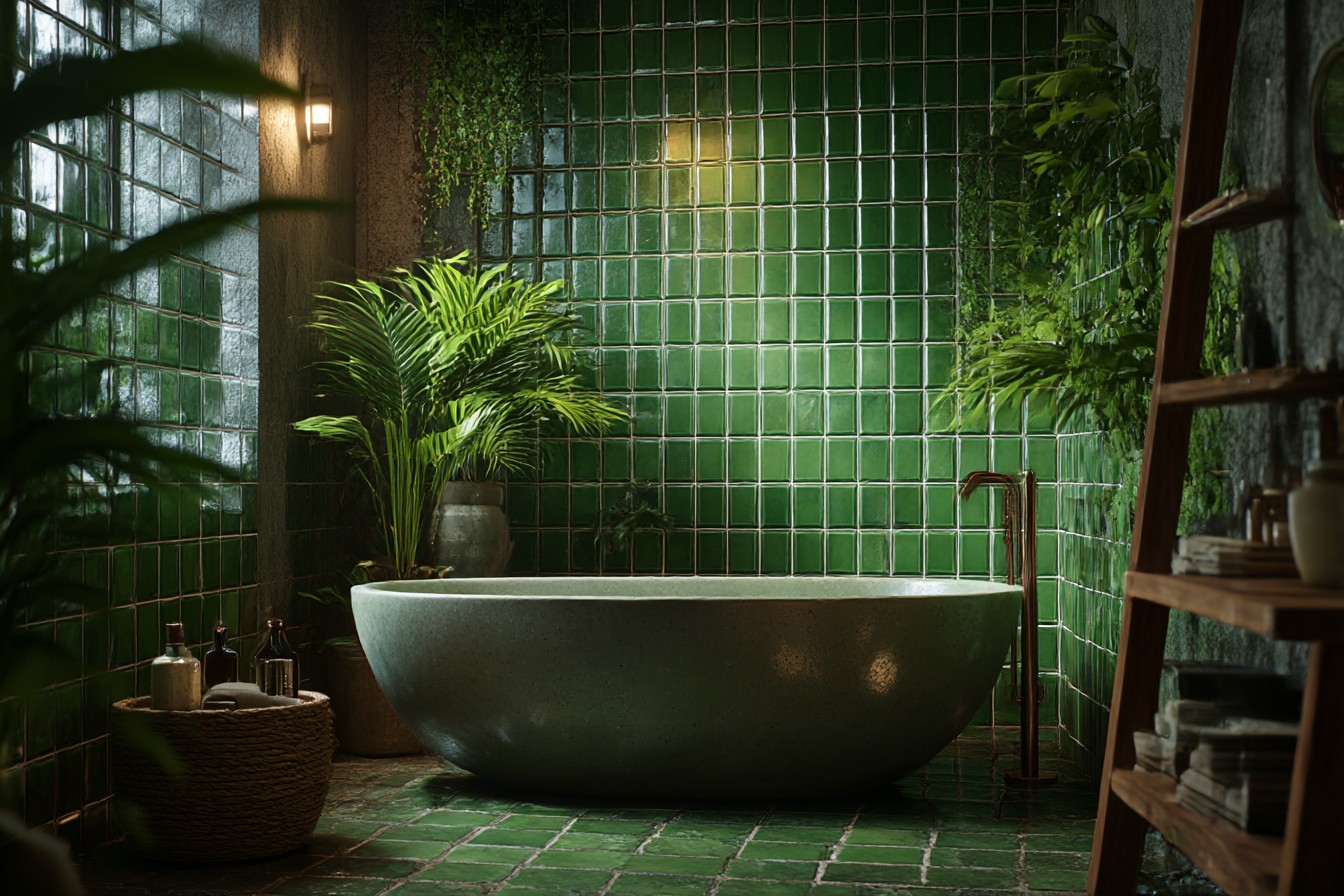
The more I looked into it, the more I realised green tile isn’t some mad new trend. It’s been around forever, just done badly for a while. Those avocado bathroom suites that still pop up in Victorian terrace viewings? They gave green a terrible reputation. But what we’re talking about now is completely different sophisticated, muted greens that somehow manage to feel both calming and alive at the same time.
I decided to test the waters properly before committing to a full wall. Bought one single tile from the trade counter at Topps Tiles cost me £3.20, which felt ridiculous for one tile, but better than regretting hundreds of them. It was this gorgeous sage green with grey undertones that the sample called “Forest Whisper” or something equally pretentious. I blu-tacked it to the bathroom wall next to the mirror and lived with it for three weeks.
Best decision I made, honestly. That one tile taught me everything I needed to know. In the harsh morning light when I was rushing to get ready, it looked almost grey. Sophisticated, not shouty. When the room got steamy after evening baths, it warmed up to this beautiful soft green that made the whole space feel bigger somehow. Even under our terrible ceiling light one of those builder-grade spotlight things that makes everyone look ill it still felt natural.
After those three weeks, I was sold. Ordered enough 150x75mm subway tiles to cover the shower area and the wall behind the basin. Went for the same sage green but from a different supplier B&Q had them for £18 per square metre, which was only about four quid more than their basic white ones. The tile shop tried to talk me into some fancy textured ones at forty quid per metre, but I’m not made of money, and anyway, simple subway shapes let the colour do the talking.
Installing them was straightforward enough, though I did learn a valuable lesson about grout colour. My first instinct was bright white grout because that’s what I’d always done, but my tiler Pete suggested a pale grey instead. “Trust me,” he said, “white grout with coloured tiles always looks a bit cheap. Like you’re trying too hard.” He was absolutely right the grey grout made the green tiles look expensive and intentional rather than like I’d just grabbed whatever was on offer.
The transformation when it was finished was mental, in the best possible way. Where the bathroom had felt cold and clinical before all white tiles and chrome fittings that looked like they belonged in a chain hotel it now felt warm and welcoming. Not dramatically different, just… better. More human, if that makes sense.
People started commenting on it almost immediately. My mum, who’s usually quite conservative about home décor, said it reminded her of expensive spas. Danny’s sister, who works in interior design and is normally quite critical, spent ages taking photos of it. Even the plumber who came to fix our radiator asked where we’d got the tiles from because his wife had been looking for something similar.
That psychological effect is real, too. I don’t know if it’s because green is supposed to be restful or because it reminds us of being outdoors, but the bathroom genuinely feels like a nicer place to spend time. Not that I’m hanging about in there for fun, but those morning routines and evening wind-downs feel more pleasant somehow. Less rushed, more considered.
From a practical standpoint, it’s been brilliant. The darker colour hides water marks so much better than white tiles ever did. Our water’s quite hard, so we get those chalky deposits on everything, but they’re barely visible on the green tiles. Same with soap scum and general bathroom grime it’s there, obviously, but it’s not staring you in the face demanding immediate attention like it was with the white tiles.
I’ve tried green in other spaces since then, with mixed results that taught me loads about choosing the right shade. In our downstairs loo, I went for a darker forest green in small hex tiles. Looked incredible with the brass tap and wooden vanity unit, very boutique hotel. But I also tried a mint green in a friend’s rental bathroom that looked gorgeous in the showroom but felt a bit cold and institutional once it was up. The lighting in that bathroom was rubbish though no natural light and one of those blue-white LED strips that makes everything look harsh.
The key thing I’ve learned is that green tiles with grey or blue undertones are much more versatile than ones that lean yellow or brown. They work with pretty much any metal finish we’ve got brushed brass taps and towel rails, and they look perfect together. They’d work equally well with chrome or black fittings. And they’re brilliant with natural materials like wood and stone, which you can’t always say about coloured tiles.
The shade you pick is everything though. I made the mistake of ordering some olive green tiles online for a friend’s en-suite without seeing proper samples first. They looked beautiful on the website, but when they arrived, they had this weird yellow undertone that made the room feel sickly under artificial light. We ended up returning them and starting again with a blue-green instead, but it cost time and money we didn’t have to spare.
Now I always tell people to get actual tile samples, not just those tiny chips they give you in shops. Proper full-size tiles that you can stick on the wall and live with for a few days. Test them in your actual lighting conditions, at different times of day, when the room’s steamy and when it’s dry. It might cost a few quid upfront, but it’s nothing compared to the cost of getting it wrong.
The green tiles have created this perfect backdrop for plants, too, which I never expected. I’ve got a small snake plant on the windowsill and a trailing pothos hanging from a hook in the ceiling, and they look like they were always meant to be there. The tile colour doesn’t compete with the plant colours; it complements them in this really natural way that makes the whole room feel more connected to the outside world.
After living with green bathroom tiles for nearly a year now, I can honestly say it was one of the best decorating decisions I’ve made. It’s not trendy in a way that’ll look dated next year it’s just a return to colours that feel natural and human rather than sterile and institutional. Every morning when I’m brushing my teeth, I catch sight of those tiles in the mirror and think “Yeah, we got that right.” That’s worth more than playing it safe with white subway tiles for the hundredth time.