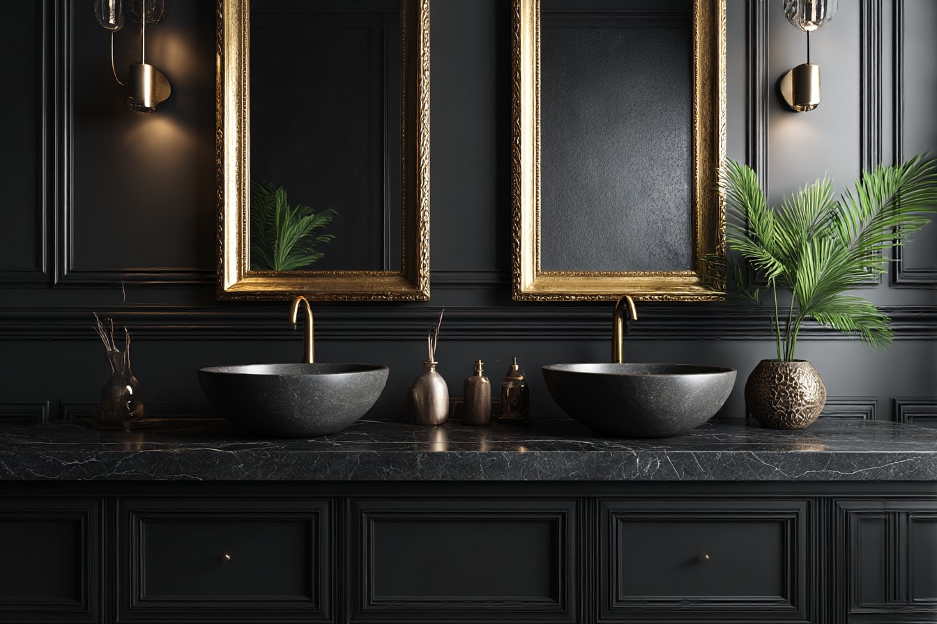
The moment I stepped into Sarah’s bathroom last spring, something clicked. Not in an obvious, dramatic way – more like this quiet recognition that everything just worked. The black vanity dominated the space but somehow made everything else look better, more intentional. I found myself actually touching it (which is weird, I know, but the matte finish was incredible) and thinking why the hell don’t more people do this?
My own bathroom had been driving me mental for months. The honey oak vanity from the previous owners wasn’t terrible, exactly – just aggressively mediocre in that early 2000s way. Every morning I’d catch myself in the mirror thinking about how bland everything looked. Beige walls, beige feelings, you know? It was functional but soul-crushing, which sounds dramatic but honestly describes a lot of developer bathrooms perfectly.
I’d been putting off the renovation because bathrooms are expensive and I wasn’t sure what direction to go. But seeing Sarah’s place made something obvious – sometimes you need one bold element to anchor everything else. Black vanities can ground a space without turning it into a cave, assuming you don’t mess up everything around them.
The finish choice becomes massive when you’re dealing with black. I spent probably three weeks researching this, which my girlfriend found hilarious because I’d never cared about cabinet finishes before. Matte black looks sophisticated, almost velvety when you run your hand across it. It hides fingerprints brilliantly – important when you live with other humans who apparently touch everything with toothpaste-covered fingers. But water spots show up more on matte finishes, so you’re wiping it down daily if you care about that stuff.
Glossy black reflects light beautifully and can make tiny bathrooms feel bigger. One wipe and it’s gleaming again. The problem is every single fingerprint, water drop, and bit of dust shows up like it’s highlighted with a marker. I tested this extensively at three different showrooms, splashing water on display models and probably looking completely unhinged to the sales staff. But I needed to know what I was getting into maintenance-wise.
I ended up with satin finish – compromise between the two extremes. Still looks sophisticated but doesn’t require obsessive cleaning, which suits my lifestyle better than I probably want to admit.
Hardware selection became this whole thing because it’s literally the first detail people notice. Brass against black photographs beautifully and creates this rich, vintage-inspired contrast that’s everywhere on Instagram right now. I was convinced I wanted brass until I held actual samples against my chosen vanity and realized it felt too try-hard for my space. Sometimes what works in photos doesn’t work in real life.
Chrome feels crisp and modern, practically bulletproof in terms of maintenance. Doesn’t tarnish, relatively scratch-resistant, works with any faucet finish you choose. Matte black hardware creates this monochromatic look that’s undeniably sleek, though you lose visual interest. After several trips to the hardware store with paint chips and cabinet samples (yes, I became that person), I chose brushed nickel. Sophisticated but not demanding, easy to maintain, warm enough to prevent the whole space from feeling stark.
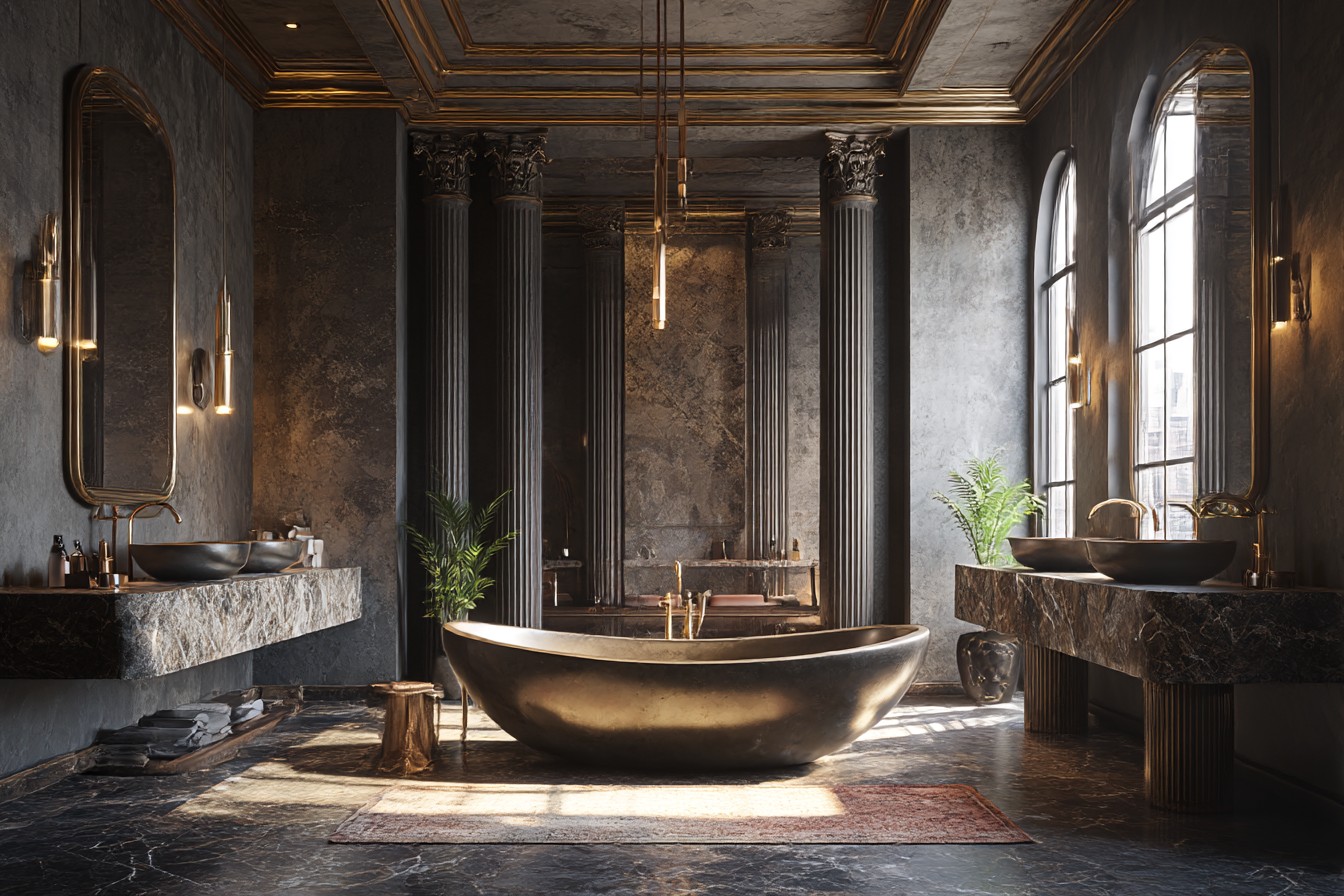
The countertop decision nearly broke my brain. White quartz or marble creates classic tuxedo elegance – timeless and expensive-looking, though white surfaces require vigilance about staining. I learned this lesson during my kitchen renovation when red wine and white counters had an unfortunate encounter that still haunts me.
I chose warm gray quartz with subtle veining instead. It bridges the black base and white walls without being too high-contrast. Gray also hides minor imperfections better than pure white, which matters when you’re dealing with daily makeup disasters and the occasional coffee mug that somehow ends up in the bathroom (don’t judge me, morning routines are chaotic).
Natural stone looks stunning but requires sealing and careful maintenance. I considered black granite for exactly five minutes before realizing black-on-black might be overkill, even for someone who likes bold choices. Sometimes restraint is the braver design decision, though that took me a while to accept.
Preventing cave-like feelings requires thoughtful surrounding elements. Light walls are essential – I went with soft white that has just a hint of gray undertone. The paint selection alone took three weeks because apparently there are seventeen thousand variations of “basically white” and choosing wrong would haunt me forever.
Lighting becomes absolutely critical with dark cabinetry. You need enough ambient light to keep things open plus adequate task lighting for daily routines. I installed recessed overhead lights and wall sconces flanking the mirror. The sconces cast light both up and down, preventing harsh shadows and creating this lovely, even glow across the black surface that makes everything look more expensive than it actually was.
The mirror helps tremendously too. Large mirror above the vanity serves its obvious purpose but also reflects light around the room and creates the illusion of more space. I chose one with a thin black frame to tie into the vanity without overwhelming the proportions – learned about visual weight from watching too many design videos during lockdown.
Floor choice matters more than expected. Light-colored tile keeps the overall feeling bright and prevents the black vanity from feeling too heavy in the space. I went with large white subway tiles in a herringbone pattern – classic enough to be timeless but interesting enough to add personality without competing with the vanity.
Storage considerations become important with darker cabinetry because you can’t see inside as easily. Good interior lighting or light-colored interior finishes help immensely during rushed morning routines. My vanity has soft-close drawers with white interiors, making it easier to find things quickly when I’m running late for work.
Living with the black vanity for over a year now, I can honestly say it was the right choice. It anchors the entire bathroom design and creates this sense of intentional sophistication that I never achieved with the old oak situation. Every morning feels slightly more elegant, which might sound ridiculous but genuinely impacts how I start my day. Sometimes the smallest design choices make the biggest difference in how a space feels to actually live in rather than just look at.