You know that feeling when you walk into someone’s bathroom and it’s so blindingly white and sterile that you half expect a nurse to appear with a clipboard? Yeah, well, I created exactly that nightmare in my own flat about two years ago. Brilliant move, Marcus.
I’d been putting off doing anything with our tiny bathroom for ages – teaching’s one of those jobs where you come home knackered and the last thing you want to do is think about grout and paint samples. But the previous owner’s decorating choices were getting to me. We had this horrible peachy-pink suite that looked like it was installed sometime during the Major government, and I finally snapped and decided to go full minimalist. White everything. Clean, simple, sophisticated, right?
Wrong. So incredibly wrong.
I went to B&Q on a Saturday morning, bought the cheapest white paint they had (something called “Brilliant White” which should have been a warning), slapped it on the walls, and stood back feeling quite pleased with myself. My girlfriend took one look and said it reminded her of the loos at her old school. Not exactly the vibe I was going for.
The problem wasn’t that it was white – the problem was that it was boring white. Flat, lifeless, one-dimensional white that made you feel like you needed to disinfect your hands just from looking at it. I’d basically created the world’s smallest and most depressing medical facility.
But I’m stubborn, and I’d already spent the weekend painting, so I convinced myself it just needed time to “grow on me.” Spoiler alert: it didn’t. Every morning for about six months I’d brush my teeth while staring at these soul-crushing walls and think about how I’d managed to make our already tiny bathroom feel even more claustrophobic.
The transformation happened gradually, mostly because I couldn’t afford to gut the whole thing again. Started with the shower curtain, actually. Our old one had developed some questionable stains that I preferred not to investigate too closely, so I needed a replacement anyway. Instead of getting another cheap plastic one, I found this cotton waffle-weave curtain at John Lewis (on sale, obviously – teacher salary and all that).
The difference was immediate. Suddenly there was texture in there, something for your eyes to actually focus on instead of just bouncing off flat surfaces. The little squares in the weave caught the light from our tiny window and created these subtle shadows that made the whole space feel more… three-dimensional, I suppose.
That got me thinking about surfaces properly for the first time. Everything in there was smooth and flat – the walls, the mirror, even the bloody towel rail was just a straight chrome bar. No wonder it felt like a laboratory. I started looking around for ways to add interest without spending a fortune or doing major structural work.
The medicine cabinet was my next victim. The original was this cheap flat rectangle that looked like it came free with a packet of cereal. I replaced it with one that had beveled edges – nothing fancy, just enough detail to create some shadow lines when the light hit it. Cost about forty quid from Wickes but made a massive difference.
Then I tackled the hardware situation. Those basic chrome cabinet handles had to go. I spent ages wandering around homeware shops touching different finishes like some kind of handle pervert, trying to figure out what would warm up all that stark white. Ended up with brushed brass pulls that had a slightly hammered texture – not shiny enough to look flashy, but warm enough to make the space feel less clinical.
Here’s something nobody tells you about white paint: it’s not actually white. I mean, obviously it is, but there are about fifty million different versions of white, and they all look completely different depending on what light you’ve got. Our bathroom faces north so it gets quite cool light, and my original “Brilliant White” had blue undertones that made the whole room feel like the inside of a freezer.
I learned this lesson properly when I went to buy a new mirror frame. Brought home three different “white” options from different shops, and they looked like completely different colours once I got them in the bathroom. One was so pink it made me feel slightly nauseous, another was practically grey, and the third – which had just a hint of cream in it – suddenly made everything else in the room look warmer and more inviting.
That’s when I started understanding that the trick with white isn’t to find the purest, most neutral white possible. It’s to find the right white for your space and your light. Sounds obvious now, but it genuinely hadn’t occurred to me before.
Materials became my secret weapon after that. I added a small wooden stool for extra storage – painted it white obviously, but I used a paint that let the wood grain show through slightly. Just having that natural texture in there gave my eyes something interesting to look at instead of all those smooth surfaces.
Found these brilliant ceramic soap dispensers at TK Maxx that had a matte finish and felt like smooth pebbles. Still white, still fitting the scheme, but they had this organic quality that made the whole room feel less like it had been manufactured in a factory somewhere.
The plant situation took some trial and error. I tried a snake plant first because everyone says they’re indestructible, but it looked ridiculous in our tiny space – like putting a giraffe in a phone box. What actually worked was a simple pothos in a white ceramic pot with proper drainage. The trailing green against all that white created exactly the contrast the room needed, and it actually thrives in bathroom humidity, which was a bonus since I’ve got form for killing houseplants.
Lighting was absolutely crucial, though I didn’t realize how much until I started experimenting. The original setup was just one overhead fixture that cast these harsh shadows and made everything look flat and institutional. I added a small battery-powered LED strip under the medicine cabinet that gives off warm light, and suddenly the white walls looked creamy instead of stark.
I also learned about paint finishes the hard way. My first attempt was flat paint because it was cheapest, but flat paint in a bathroom is basically asking for water damage and impossible-to-clean marks. Tried high-gloss next, which was practical but made the room feel like the inside of a fridge. Finally settled on eggshell for the walls and semi-gloss for the trim – the slight difference in sheen creates definition without being obvious about it.
Storage became part of the decor instead of something to hide. Got some white wicker baskets from IKEA that hold spare toiletries and toilet rolls, and they add texture while staying within the colour scheme. Also found this white wooden ladder shelf thing that displays rolled towels – functional but also creates these interesting geometric lines against the walls.
The floor was my biggest expense, but absolutely worth it. Instead of plain white tiles, I went for white subway tiles laid in a herringbone pattern. Same colour, completely different personality. The pattern creates movement and visual interest while staying monochromatic, and the slightly beveled edges catch light beautifully throughout the day.
What I discovered was that layering different shades of white is absolutely key. Pure white next to cream next to off-white creates depth that tricks your eye into seeing complexity where there’s actually simplicity. It’s like… well, it’s like a song played in one key but with lots of different instruments. The variations make it interesting.
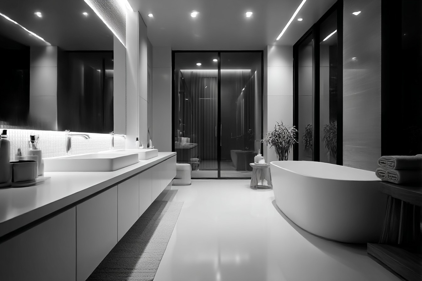
The biggest surprise was how much warmer the bathroom feels now. White doesn’t have to be cold or clinical. With the right textures, undertones, and lighting, it can feel cozy and peaceful instead of sterile and depressing. You just need to give your eyes multiple things to focus on within that colour family.
Now when people come round they actually compliment the bathroom, which never happened with my original prison-cell aesthetic. Same basic space, same fundamental colour scheme, but completely different feel. Just goes to show that boring isn’t about the colour you choose – it’s about how much thought you put into using it properly.


