That glossy white paint in my downstairs loo looked so clean and fresh when I moved in. Three months later? It was basically a fingerprint museum. Every smudge, every splash from washing hands, every time someone leaned against the wall while brushing teeth all of it showed up like evidence at a crime scene.
I'd been avoiding doing anything about it because, honestly, bathroom renovations scare me. The moment you start talking about removing tiles or installing new fixtures, you're looking at thousands of pounds and weeks of disruption. But paint? Paint I can handle. And what I discovered is that the right paint choices can completely transform how a bathroom feels without touching a single tile or tap.
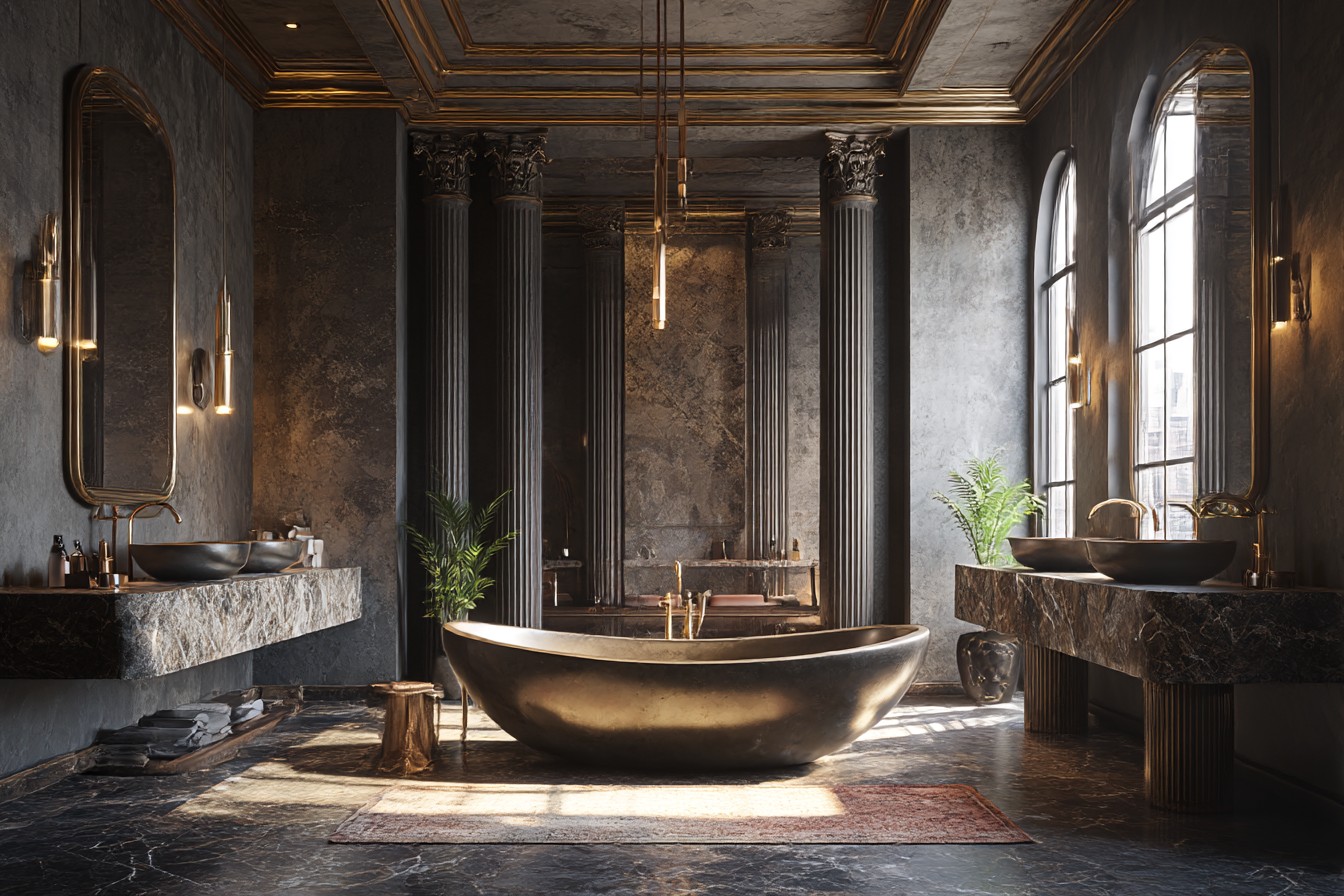
My first experiment was bold, probably too bold. I painted one wall in my main bathroom a deep navy blue Benjamin Moore's Hale Navy, if you're curious. My partner thought I'd lost my mind. "It'll make the room feel smaller," he said. "It'll look dated in two years." Wrong on both counts, thankfully. That navy wall actually made the white fixtures pop like they never had before, and somehow the room felt more expensive, more intentional. Instead of shrinking the space, it created depth.
The trick was choosing the right wall. I went for the one behind the toilet not because it's hidden, but because it's the wall you see when you first walk in. It sets the tone for the whole room. Plus, if you're going to do something dramatic, might as well commit.
But here's what I learned about bathroom paint the hard way: moisture is your enemy. That gorgeous navy looked perfect for about six months, then I started noticing tiny bubbles along the bottom edge where steam collects. Turns out I'd used regular emulsion instead of bathroom-specific paint. Rookie mistake. When I repainted, I invested in Dulux Easycare Bathroom costs about thirty percent more, but it's designed to handle humidity without peeling or bubbling.
My sister took a completely different approach in her ensuite. She did what she calls "the hotel trick" painted the bottom half of the walls in a rich charcoal grey, then kept the top half white. The dividing line sits exactly where a chair rail would go, about three feet up. It sounds fussy when I describe it, but it's actually genius. The dark bottom section hides scuffs and water marks, while the white top keeps everything feeling bright and open.
She used painter's tape to get that perfectly straight line, but here's her secret: she painted over the tape edge with the base colour first, let it dry, then applied the contrast colour. Prevents bleeding under the tape. Learned that one the hard way when I tried the same technique and ended up with wonky, feathered edges that looked like I'd painted with my eyes closed.
The two-tone thing works brilliantly in powder rooms too. My neighbour painted her tiny downstairs toilet with the top portion in soft pink think blush, not Barbie and the bottom in white. Sounds bizarre, I know, but it's actually really sophisticated. The pink makes the ceiling feel higher, and the white wainscot effect (even though it's just paint) gives it that expensive millwork look without the carpenter's bill.
Accent walls aren't the only way to add drama. I've been experimenting with what I call "sneaky colour" painting just the ceiling or the inside of a window alcove. My upstairs bathroom has this awkward recessed area where the window sits, and I painted it the same sage green I used in my living room. Nobody expects colour there, so it's like a little surprise. Plus, it ties the bathroom to the rest of the house in a subtle way.
The ceiling trick works especially well in bathrooms with slanted roofs or interesting architectural details. My friend Sarah painted her bathroom ceiling a soft lavender Farrow & Ball's Pale Powder, which probably cost more per litre than my monthly coffee budget and it's absolutely stunning. The colour reflects down onto the white walls just enough to give everything a gentle, warm glow.
But let's talk about practical considerations, because Instagram-worthy paint choices don't mean much if they can't survive real life. Steam from hot showers is obviously the big one, but there's also toothpaste splatter, hair product mist, and general grubby finger marks. I've found that satin finish works better than matt in bathrooms easier to wipe down without leaving marks.
Also, test your colours in different light. That gorgeous deep green I thought would look moody and spa-like? Under the harsh LED spotlights, it looked like hospital scrubs. I ended up switching to warmer bulbs, but it was an expensive lesson in how lighting affects colour perception.
Storage areas are perfect for experimenting with bold choices too. I painted the inside of my bathroom cabinet bright yellow just for fun, really, but every time I open it, it makes me smile. Cost about three pounds worth of tester pot paint, took twenty minutes, and it's such a tiny hit of unexpected joy.
One thing I wish I'd known earlier: primer matters more in bathrooms than anywhere else. The humidity and temperature changes mean paint needs extra help staying put. I always use a high-quality primer now, even when the paint claims to be self-priming. It's an extra step and extra cost, but it's cheaper than repainting in six months when everything starts peeling.
The best bathroom paint experiment I've done recently? Painting my old wooden window frame to match the wall colour instead of keeping it white. Such a small change, but it makes the window look bigger and the whole wall more intentional. Sometimes the smartest design moves are the ones that feel almost invisible.