I was at my mate James’s place last month using his bathroom, and something just clicked. The space wasn’t doing that weird performative masculinity thing you know, the leather accessories and industrial pipe towel racks that scream “I AM A MAN” but it felt properly refined. Understated. Like someone with actual taste lived there.
Got me thinking about how badly most blokes get bathroom design wrong, myself included for years. It’s either sterile white hotel bathroom territory or full-on man cave madness with exposed brick and vintage beer signs. Neither feels right when you’re actually living with it day to day.
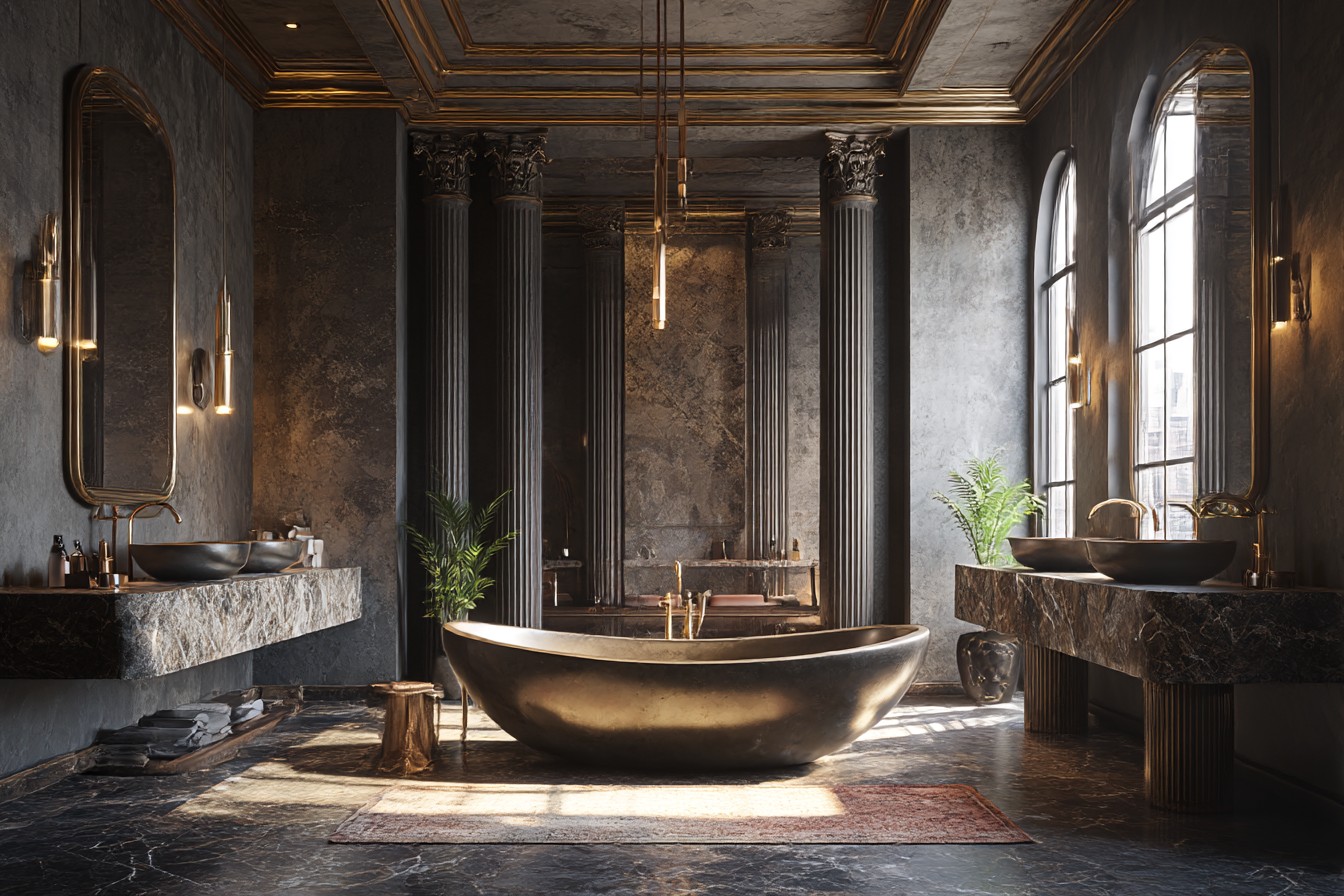
My old flat’s bathroom was absolutely criminal. Standard new-build developer special white tiles, white grout, white everything. Looked fine for about six months until that grout started going grey and the whole place just felt… sad. Then there was my cousin’s bathroom renovation disaster, all black marble and chrome that probably cost him five grand but felt like bathing in a funeral parlor. Impressive photos though.
I’d been putting off sorting my guest bathroom for ages because I genuinely didn’t know what I wanted. Spent months scrolling through design websites seeing the same tired “masculine” clichés over and over. Dark wood everywhere. Subway tiles with black grout. Edison bulb fixtures. It all felt like someone else’s idea of what men should like rather than what actually works.
The breakthrough came when I stopped thinking about masculine design as a statement and started thinking about it as just… good design. Quality materials, clean lines, nothing trying too hard. Functional but not boring. That’s what James had nailed in his place.
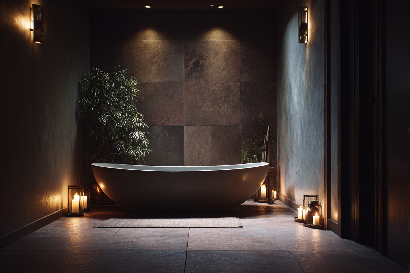
So I ripped everything out and started over. The tiles were the first big decision went with these massive concrete-effect porcelain ones instead of actual concrete because I’m not insane and don’t want to be sealing floors every few months. Got them in 24×24 inch size which meant way fewer grout lines and a much cleaner look. Cost about £40 per square meter from Topps Tiles, which wasn’t cheap but wasn’t designer prices either.
The grout was where I learned from previous mistakes. White grout looks fresh for about five minutes then shows every bit of dirt forever. Went with charcoal grey instead and two years later it still looks spot on. Such a simple thing but makes massive difference to maintenance.
Vanity took me weeks to choose because everything looked either too rustic farmhouse or too modern white box. Finally found this floating walnut unit online proper wood veneer, not that printed stuff with an integrated sink. Cost around £800 which felt like loads at the time but honestly, the quality shows. My old IKEA vanity looked fine until it didn’t, then it just looked cheap. This one still makes me happy every time I see it.
Lighting nearly broke my brain. Overhead downlights make everyone look terrible, but I didn’t want those Hollywood mirror bulbs either. Ended up with these linear LED strips mounted vertically on either side of the mirror. Very architectural, proper even light for shaving, doesn’t feel clinical. Got them from a lighting specialist in town rather than DIY store sometimes the extra cost is worth it for things you’ll look at every day.
Went matte black for all the fixtures and fittings. Taps, towel rails, shower bits, everything. Sounds dramatic but it’s actually much more subtle than chrome and hides water spots brilliantly. My parents visited after I’d finished and Dad immediately noticed the fixtures, said they looked “expensive” which I think was his way of approving.
The shower was where I properly spent money. Rainfall head plus separate handheld on a sliding rail, all fed from a thermostatic valve so the temperature stays constant. Added one built-in corner shelf at shoulder height learned from my old place where I had those horrible wire caddies hanging everywhere. Looks so much cleaner with storage properly integrated.
Painted the walls this warm grey that changes character throughout the day. Looks almost charcoal in evening light but doesn’t feel oppressive during the day. Took ages to find the right shade must have tested eight different colors on sample patches. Pro tip: paint massive squares, not little brushstrokes, and look at them over several days before deciding. That £5 sample pot could save you repainting entire rooms.
Made some proper mistakes along the way. Initially bought towel rails that looked fine in the showroom but were comically small once installed. Had to swap them for longer ones, which meant extra holes to fill and touch up. Also discovered that matte black fixtures need different cleaning regular bathroom sprays leave streaks but microfiber cloth with just water works perfectly.
Storage was tricky because I didn’t want wall cabinets making everything feel cramped. Put in a recessed medicine cabinet behind the mirror instead you get the storage without any visual bulk. Under the floating vanity, added a simple shelf in matching walnut for extra towels. Nothing fancy, just a wooden ledge, but it keeps things tidy.
Window blind in the same walnut finish as the vanity. Could have gone for something contrasting but honestly, the space works better when everything coordinates without being matchy-matchy. It’s about creating harmony rather than making statements.
The details matter more than I expected. Proper thick towels in charcoal grey instead of those thin white ones that show everything. Simple ceramic soap dispenser no plastic pumps anywhere. Even swapped the standard toilet roll holder for a simple horizontal bar. Sounds insignificant but these little touches add up.
What surprised me most was how much calmer the space feels compared to before. Friends always comment on it when they visit usually something about it feeling “grown up” or “hotel-like” but in a good way. That’s exactly what I was after, that sense of quiet sophistication.
Total cost was around £3,500 including labor for the tiling and plumbing work. Not cheap but spread over two months it was manageable, and honestly it’s made such a difference to how the flat feels overall. Invested in the big-ticket items tiles, vanity, fixtures and kept everything else simple.
The key insight from the whole project was that good masculine design isn’t about symbols or stereotypes. It’s about confidence expressed through restraint. Quality materials. Thoughtful details. Nothing unnecessary. The best compliment I got was from my girlfriend who said it felt like “a proper grown-up bathroom” exactly what I was hoping for without really knowing it.
Two years on and I still love using the space every day. No regrets about any of the choices, which is pretty rare for renovation projects. It proves that masculine doesn’t have to mean moody or aggressive sometimes it just means well-considered and built to last.