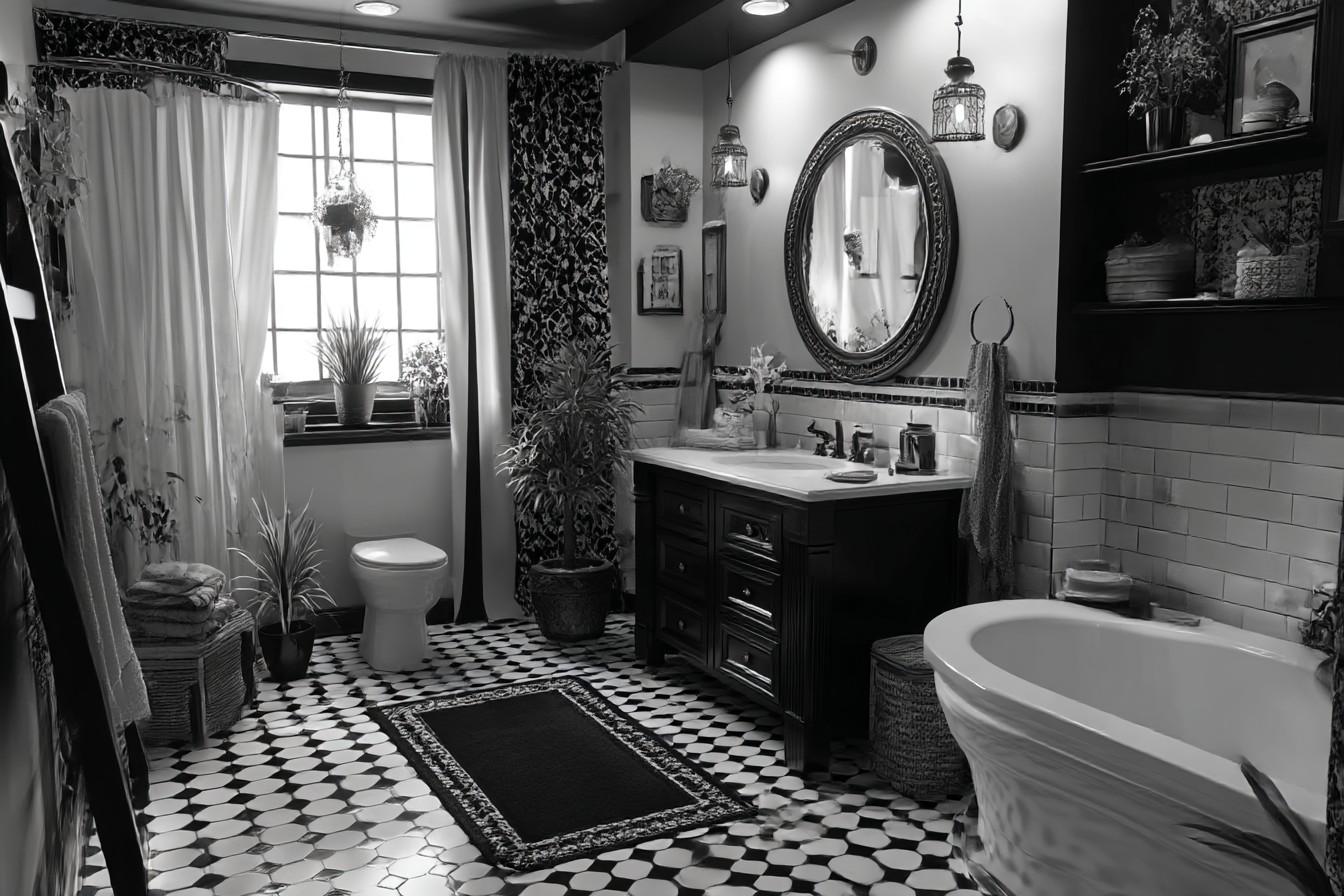
Everyone kept telling me black and white bathrooms were “safe” and “timeless” when we were planning our renovation, but honestly? I thought they’d be dead boring. You know what changed my mind? Walking into my sister-in-law’s downstairs loo last Christmas and literally stopping mid-conversation. She’d done this incredible thing with black Metro tiles halfway up, white above, these gorgeous brass taps, and a mirror that looked like something from an old hotel. It was… dramatic. Sophisticated. Everything I thought black and white couldn’t be.
That’s when it hit me – this colour combination isn’t the easy option everyone makes it out to be. It’s actually quite tricky to get right, and I learned that the hard way over the next few months.
My first attempt was embarrassingly predictable. White walls, white suite, black towels and a black blind. Basically what you’d see in a rental property trying not to upset anyone. It looked fine, I suppose, but fine isn’t what you want when you’re spending your own money, is it? The whole thing felt flat, like I’d given up halfway through decorating and just… stopped.
So naturally, I overcorrected. Painted three walls this moody charcoal colour, kept the white suite, added some dramatic lighting. Very Instagram-worthy, terrible for actually using. Couldn’t see properly to do my makeup, and checking whether I’d got all the toothpaste off Amara’s face became a proper challenge. Beautiful in photos though, which tells you everything about how practical it was.
The lightbulb moment came when I stopped thinking about black and white as just two colours and started treating them like ingredients in a recipe. You know how the best dishes work because of contrast – sweet and salty, smooth and crunchy? Same thing here. The magic happens when you layer them properly, not just plonk them down and hope for the best.
Pattern mixing was my breakthrough, though I was terrified to try it initially. What if it looked chaotic? But here’s the thing about black and white – it gives you this amazing safety net for experimenting. I ended up with geometric floor tiles, striped towels, and this gorgeous wallpaper with tiny botanical prints behind the sink. Should have been a mess, but somehow it all worked because the colours kept everything grounded.
I learned this lesson after buying £200 worth of plain white everything – towels, bath mat, shower curtain – thinking it would look “clean and minimal.” Instead, it looked unfinished, like I’d run out of ideas or money. Sometimes the safe choice is actually the wrong choice.
My current setup has hexagonal floor tiles with black borders, vertical subway tiles in the shower, and that botanical wallpaper I mentioned. Different patterns at different scales, but they create this rhythm that actually makes sense. It’s like… visual music, if that doesn’t sound too pretentious.
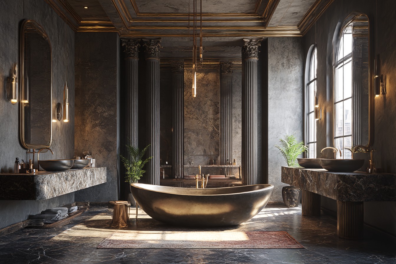
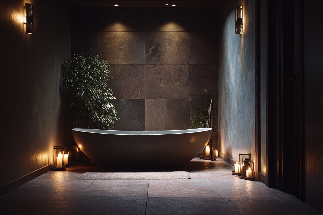
Texture made all the difference too. Smooth surfaces everywhere just feels cold, especially with this colour scheme. I added woven storage baskets from IKEA, a chunky bath mat that actually stays put (miracle), some reclaimed wood shelving that Liam’s dad helped me put up, and switched to matte black taps instead of the chrome ones we had. The contrast between the glossy tiles and matte paint, between the smooth sink and textured baskets – that’s what makes it feel like a real room instead of a showroom.
Can we talk about lighting for a minute? Because this is where so many people go wrong, and I was definitely guilty of it. Harsh overhead lighting turns black features into these imposing dark masses and makes white surfaces look like a hospital. I spent £50 on dimmer switches – best money I’ve ever spent on this house, honestly – and added some LED strips under the floating shelves for ambient lighting.
You need different light sources at different levels. Overhead for when you’re cleaning or dealing with a toddler’s bath time disasters, vanity lights for actually seeing what you’re doing, and softer accent lighting for when you want a relaxing soak after said toddler has finally gone to sleep.
Here’s something nobody tells you: black and white doesn’t mean you can’t have any other colours. Small touches of warmth stop the whole thing from feeling too stark. I keep eucalyptus branches in a black ceramic vase because they smell lovely and add this soft green, there are white orchids on the windowsill when I remember to water them, and I switched from pure white towels to this pale grey that’s much more forgiving when Amara decides to “help” with handwashing.
The quality of materials matters so much more than I expected. Cheap white plastic looks cheap, end of story. But proper white ceramic, or painted wood, or even just well-chosen tiles? Those look intentional and grown-up. Same with black – anything that might chip or fade will drive you mad. I made this mistake with a black shower organiser that started showing white scratches after about two weeks. Now I spend more on the basics and save money on accessories I can easily swap out.
Storage gets complicated with this scheme because everything’s so visible. Clear containers look clinical, coloured ones clash. I found these vintage-style black glass jars for cotton wool and bath stuff, white ceramic pots for everyday bits, and natural woven baskets for hiding the less attractive necessities. The key is choosing storage that looks like it belongs, not just functional afterthoughts.
One thing I wish I’d considered earlier – don’t forget about the ceiling. White ceilings are safe but predictable. I painted ours the same soft grey as the vanity unit, and it made everything feel more sophisticated somehow. In our small bathroom, it actually makes the space feel bigger because there’s no harsh line where the walls meet the ceiling.
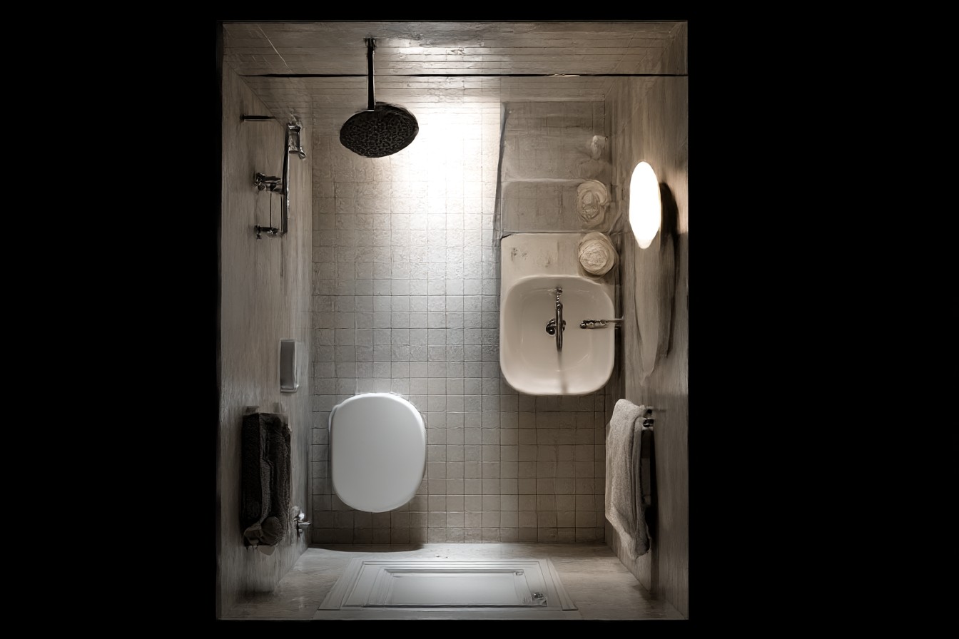
The maintenance side of this scheme is… well, it’s a lot. Dirt shows up on white, water spots show on black, and with a three-year-old who thinks soap is optional, everything gets grubby fast. I keep microfibre cloths handy and do a quick wipe-down most days. Sounds like effort, but it’s thirty seconds versus the deep-clean marathons I used to dread. Black taps hide water spots better than chrome – another lesson learned the hard way.
What I love about this colour combination is how timeless it is, but that doesn’t mean it has to look old-fashioned. Current touches that feel fresh but not trendy include those matte black fixtures I mentioned, interesting mirror shapes instead of plain rectangles, and geometric patterns that won’t look ridiculous in five years’ time.
My advice, if you’re thinking about this? Start with your biggest surfaces – walls, floor, main fixtures – in proportions that work for your space and natural light. Our bathroom faces north so I kept more white than black to stop it feeling cave-like. Then layer in your patterns and textures and those little touches of warmth that make the difference between looking like a magazine and feeling like home.
The goal isn’t perfection – trust me, with a toddler and another baby coming, perfection isn’t happening anyway. It’s creating something that feels elegant but comfortable, classic but not museum-like. Something that works for real life, not just Instagram photos.
And honestly? Once you get the balance right, you’ll find yourself lingering in there longer than necessary. Even when you’re seven months pregnant and your back’s killing you, sometimes the bathroom’s the only place in the house that still looks like adults live here.