That paint sample looked absolutely dreadful when I held it up to the bathroom window. I mean, properly awful – like someone had mixed concrete dust with disappointment and called it a colour. “Stormy Sky” they’d labeled it, which seemed optimistic at best. But something about it wouldn’t let me put it back on the rack, even though every rational part of my brain was screaming that grey cabinets were either going to look boring or depressing or both.
I’d been staring at my bathroom for weeks by that point, trying to work up the courage to actually start the renovation I’d been planning since I moved into this flat. Standard new-build bathroom, you know the type – honey oak cabinets that looked like they’d time-travelled from 1995, beige tiles everywhere, that peculiar shade of magnolia paint that developers seem to think is inoffensive but just ends up looking like… well, nothing really.
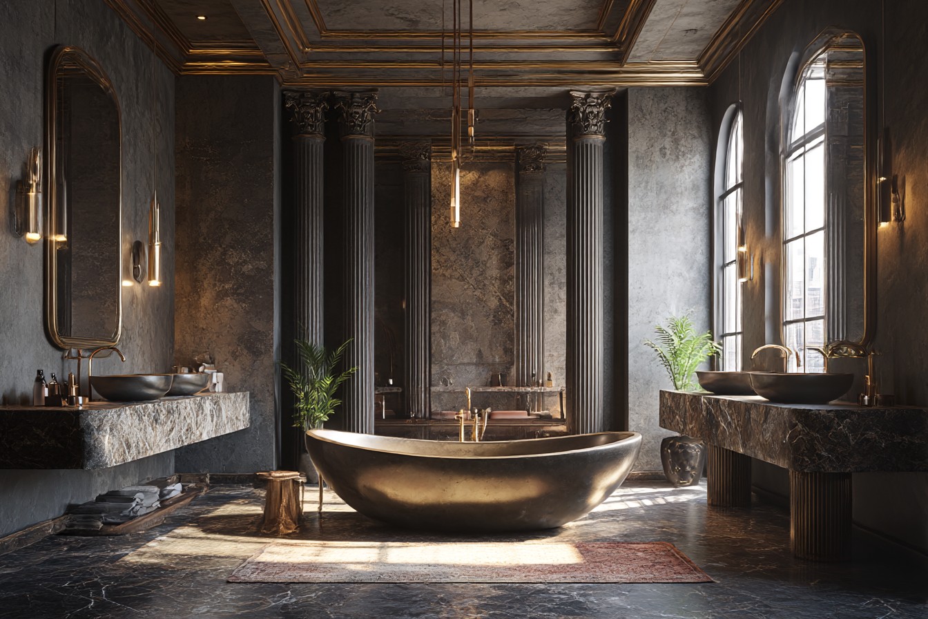
The vanity was obviously where I needed to start. Takes up half the wall, sets the mood for everything else, all that. But choosing a colour felt massive, and I’m the sort of person who takes twenty minutes to decide what to have for lunch. Too dark and my already-tiny bathroom would feel like a cave. Too light and it might just look cheap, or show every water mark and toothpaste splatter (and trust me, there are many).
That Saturday morning trip to B&Q wasn’t supposed to be a shopping expedition. More like therapeutic wandering while I avoided making actual decisions. But that grey sample kept catching my eye, and eventually I thought sod it, took it home with about fifteen others and spent the next fortnight staring at paint swatches taped to my bathroom wall like some sort of indecisive art installation.
Here’s the thing though – grey vanities are everywhere right now, and initially that put me off. I don’t particularly want my flat to look like every other renovation blog or Instagram post. But there’s a reason they’re popular, isn’t there? They’re neutral enough to work with basically anything, but they’ve got actual character. Unlike beige, which just sits there looking apologetic about existing.
When I finally committed to the Stormy Sky (after my mate Jamie came round and told me to stop overthinking it), everything else started clicking into place. Well, sort of. The hardware decision nearly did my head in completely.
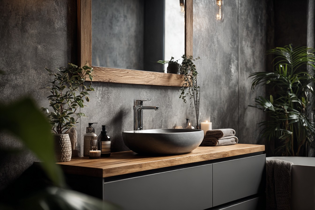
Spent about an hour in the cabinet hardware aisle, which is apparently a thing I do now. Holding different pulls up to my phone’s torch, trying to imagine them on grey doors that didn’t exist yet. Brushed gold looked nice but felt too trendy – what if I got sick of it next year? Chrome was clean but maybe too hospital-like for a space where I’d be getting ready every morning. Then I spotted these matte black pulls with just a hint of texture to them. Simple, solid, and they made the grey look more grown-up rather than trying to compete with it.
The bloke working there – Steve, I think – mentioned that matte black and grey work well together because you get contrast without drama. He was right, though at the time I was mostly just grateful someone else thought my combination wasn’t completely mental.
The countertop situation nearly broke me entirely. I’d budgeted for quartz because everyone bangs on about how practical it is – no sealing needed, won’t stain if you spill nail varnish on it, all that sensible stuff. But the bright white samples looked harsh against my grey cabinet samples, and the darker options felt too heavy for the space. Eventually found this warm white quartz with subtle grey veining that looked almost like proper marble but without the anxiety of wondering if everything was going to stain it permanently.
Nobody warns you that you’ll change your mind about seventeen different things, usually after you’ve already ordered them. My original drawer pulls were these sleek, angular things that looked incredible in the online photos. Very geometric, very modern. But when they arrived and I actually held them against the cabinet door, they felt completely wrong. Too sharp, somehow, like they belonged in an office building rather than somewhere I’d be stumbling around half-asleep at six in the morning.
Returning them was a proper pain – shipping costs, restocking fees, the usual customer service runaround. But the slightly curved pulls I ended up with feel so much better. Still contemporary, but they don’t scream “LOOK HOW MODERN I AM” at you every time you open a drawer.
Once the grey vanity was in, it became this anchor point that made all my other decisions easier, which was a relief because decision-making was clearly not my strong suit during this project. Wall colour became obvious – crisp white to keep things bright, but I added warmth with this soft taupe on the wall behind the mirror. The flooring (luxury vinyl plank that looks like weathered oak) picked up the neutral thing while adding texture and warmth underfoot.
What properly surprised me was how the grey changes throughout the day. Morning light makes it look almost blue-grey, cool and fresh when I’m trying to wake up properly. But at night under the vanity lights, it warms up and feels cozy. I hadn’t expected that kind of versatility from what looked like dishwater in the paint sample.
The storage aspect was life-changing after months of living with a pedestal sink (long story, don’t ask). Actual drawers felt like luxury. Deep ones too – I can fit all my hair styling equipment in the bottom drawer and still have room for spare towels. Those soft-close hinges were worth every penny, especially when I’m trying not to wake the entire building at stupid o’clock in the morning.
The mirror was another adventure entirely. I’d planned on a standard rectangular one, but the proportions looked boring with the grey cabinet. Too predictable, maybe? Found this round mirror with a thin black frame instead that echoes the cabinet hardware. It softens all those straight lines and makes the whole setup look more intentional, like I actually knew what I was doing.
Maintenance has been surprisingly manageable. The grey finish hides water spots better than I expected, and even my questionable toothpaste-spitting habits don’t show up as obviously as they would on white cabinets. The matte black hardware shows fingerprints a bit, but a quick wipe sorts that.
What makes this grey vanity work, I think, is that it doesn’t try to be the star of the show. It’s substantial enough to ground the whole space but neutral enough to let other things shine – the textured shower tiles I eventually got brave enough to install, the brass light fixture that took three attempts to hang properly, even the plants I’m somehow managing to keep alive on the windowsill.
It’s like having a really good pair of jeans in your wardrobe, you know? Goes with everything and makes everything else look more put-together than it probably is.
Would I choose grey again? Definitely. Though next time I might go a shade darker, just to see what happens. But knowing me, I’d probably spend another fortnight staring at paint samples first.